ASSIGNMENT 1: Your Zine
- Christine Griever

- Sep 27, 2025
- 11 min read
Your first assignment asks you to create a small publication or fanzine based on your interest in books and their design. It allows you to introduce yourself, and your interests in book design, so that your tutor can get to know you and your work better.
Your fanzine can be digitally printed, photocopied or handmade. Aim to design a sixteen-page simple folded and stapled A5 fanzine, though you can add more pages, or change the scale, if you want to. You can use any medium or materials to generate your artwork and make your publication. You may want to work much larger and reduce your artwork for the fanzine. While visually it doesn’t have to look like a punk fanzine, try and embrace the lo-fi ‘cut and paste’ attitude,
so you’re making the work relatively quickly and not too preciously. Be creative with this task both in terms of the content and how you choose to present it, this could extend to challenging some of the assumptions about what a fanzine should look like, or how it’s made.
Use the work you have produced so far, in the earlier exercises, as a starting point for your content. Not all of this material needs to be included in your fanzine. You may want to develop new visual ideas, or add to the work you have already produced.
As a guide, your fanzine should contain the following elements:
● Introduce yourself - say something about your relationship with books. Why are they important to you? Communicate this through writing and images.
● Your creative process - how do you like to work creatively, what sort of process do you follow to research and generate ideas, and what are your preferred mediums to work in. Say something about you as a creative practitioner and your approach. Show your approach to book design
through your design decisions and the hands-on sense of immediacy and energy that is an attribute of fanzine design.
● Looking at books - present the most interesting books you’ve looked at, or those you find influential as a reader, designer or both? Present a selection of books, or focus on one particular example to present in more depth. Think about how you can present these books, and your reflections, in visually engaging ways.
● Global influences - which books with a wide reaching scientific, artistic, historical, political, geographic, fictional, poetic, religious or other impact have you chosen. Present them along with a brief rationale as to why, or how these books have affected you personally. Again, can your designs echo the ideas in these books in anyway?
● The future of the book - where do you see the book heading? Show and tell. Try and summarise your thinking into a series of short statements, quotations, images or ideas. Be creative in how you approach this.
● How can you creatively respond to one or more of following book related sayings - Bookworms, A closed/open book, The oldest trick in the book, You can’t judge a book by its cover, In someone’s good/bad books, or, by the book. Use your fanzine to present your ideas. Can any of your images, text or ideas also feed into your cover designs?
Introduce yourself
I wasn't entirely sure how I was going to approach this assignment. Actually, I wasn't sure I fully understood what the assignment was asking me to do. So I decided to brainstorm about myself, but separate it into different categories that I thought I would use for the assignment.

This was quite useful because I could then use some of the keywords (photography, deep thinker, bush/safari and magazine) to create the first page of my zine. In my sketchbook, I could explore some of my ideas further and get a thumbnail of what I wanted on the front cover.

I studied GCSE Photography back in the early 2000s, and one of my projects was to do a self-portrait with split lightning. It's quite a striking photograph because it's in black and white and it looks like I'm floating.

I felt that, although the photograph is old, it would be suitable for my cover, as it lends an older fanzine look and provides space to add other images and typography layers in Photoshop. In my sketchbook, I could think about the typography with a cut look or a typewriter effect.
I thought about the earlier exercise "Don't judge a book by its cover", and thought I could incorporate this into the cover about myself. I seem to have two quotes that sum me up: "Born to be real, not perfect" and "The one most likely to surprise you."
To add to my dual heritage, I was thinking about placing an Acacia tree on the cover, perhaps as a watermark effect. It's been a while since I used Adobe Photoshop and Illustrator and I feel I need to get acquainted with the programmes again. I took a drawing from an old sketchbook and placed it into Illustrator to remove the background and change the colour.


I imported all of my images into Adobe Photoshop to layout my cover for my zine. I changed the typography and settled on the "Ransom" typeface for the title and "Perfect Thoughts", a typewriter typeface for the body copy.

I wanted to keep the cover black and white to maintain the 1970s fanzine theme. I experimented with Photoshop filters to see how I could adapt the look.


(Top L - R) 1. Torn edges 2. Stamp 3. Poster edges
(Bottom L - R) 4. Halftone 5. Photocopy 6. Colour
When I was experimenting with the filters, I realised that I didn't want it to look like it was from the 1970s, but a more updated modern version for now, with elements of a fanzine. I decided that I wanted my whole zine to have a more updated look. I settled on the original version of my cover.
Which books are important to me?
I still don't know if I'm going in the right direction for my zine. I keep re-reading the brief and I feel stuck and frustrated. I'm not sure how to start the inside pages. I ripped an image off a tissue box and stuck it into my sketchbook. I started to doodle around the image and extend it. I could think about which types of books inspire me.

1. Bible, to be grounded in faith.
2. Recipe books, to explore new flavours from around the world and also to pass down family recipes to the next generation.
3. Puzzle books, to sit under a tree and relax.
4. Travel guides to explore cultures that are new and different to my own.
5. Music, to keep scores of music and play my favourite pieces.
6. Colouring in books-to switch off and relax.
7. Children's books, because the illustrations are pieces of art and are classics.
8. Reference books, because knowledge is power.
9. Dictionary, because I live in a country with 11 official languages.
Blank journals/sketchbooks, because my life is stressful and sketching helps (image above).
Novels, thrillers-when there is a plot twist you didn't see coming.
Design books, obviously! :-)
I used Adobe InDesign to create the zine. This is the first double-page spread I produced. I used the sketch to add to the list of books that inspire me and why I choose them. I used the typewriter font to give it the feel of an old fanzine, but still maintained a clean look, which I feel is a more updated feel to the overall zine.

Creative Me - My creative process
I looked back at my previous exercises I have completed so far in this module and went back to the influential books exercise. I took inspiration from the book by Eric Carle, "The Very Hungry Caterpillar"

In my sketchbook, I took scrap pieces of tissue paper and shweshwe material that is uniquely South African and wanted to make the caterpillar South African! I tend to use brainstorming and lists to think about what I want in the design. I also produced very rough thumbnails to get a visual idea of how my ideas can come together.

I traced the image from the book.

I used this tracing to produce caterpillar pieces from printed shweshwe patterns and tissue paper.

I arranged them in a bigger A3 sketchbook and stuck them down with glue.

I drew the legs and "ears" with a gold pen (because I love all things gold and shiny) to complete the look. Then my Acacia tree in gold.

I put the images together to produce this double-page spread for the next page in my zine.

Creative Me - Visuals
I carry my cell phone around with me all the time and my brain seems to be wired to look for unusual, colourful objects or artworks with patterns. When I see something interesting, I'll take a photo! All these photos get uploaded into a digital folder for inspiration for projects or design work. When I have more time or when I'm travelling, I take my camera with me, and then I'll take more nature-based photographs, buildings and landscapes.
My process is collecting images or printed materials, gift wrap and labels. I brainstorm to spark new ideas, sketch randomly, and when I have a project to complete, create moodboards to generate colour palettes and typography (See images below) and I experiment with different mediums such as collage, watercolours, pen and anything shiny, like gold, silver or metallic. Ultimately, I like to finish most of my work in Adobe for a clean professional finish.


My style is always on the fun side, quirky and different. I try to move away from cliché ideas and develop, if the project allows, with a South African twist.

Global influence - Recipe books
I'm starting to feel that I'm going in the right direction with my zine after my initial block. I decided to concentrate on recipe books because they are global, and some families have a rich history of tradition or recipes that are passed down through generations.
My UK and South African cultures do have some similarities. However, food is very different! In my kitchen, I have very old recipe books from the UK 1980s and South Africa, and these books are special because no matter how hard you try, there is always a spill or stain that makes its way onto the page! I think this adds to the history and love for the recipe.


Fig. 2 Delia Smith's Complete Cookery Course (1982) Fig. 3 Kook en Geniet Suid-Afrikaanse Kook en Resepteboek (1951)
To add to the fun I always draw funny facial expressions on my hard-boiled eggs, this time I added the expression to my onions for my zine :-)

Sometimes, from previous modules, I remember drawings that I had completed for an exercise. I remember this one from my illustration module about mark-making. With this image, I used tea bags for the background and coffee as the medium. I thought for this project I would use this illustration for my recipe page.

Following the same layout as the previous pages, I added my images onto this double-page spread.

Global influence - My travel guides
Following on from global influences, I decided to also concentrate on travel guides. I have been fortunate to travel to many different countries. Travel guides for me, build the excitement before travelling and are helpful when I'm in the country for their small size and pull-out maps. When I return home, the books are stored on my shelf like a mini reminder of where I have been in the world.


I also have a love for looking at maps and an atlas. For this double-page spread, I wanted to incorporate photos, postcards and maps.


Photos
I took photographs of an old atlas I have and put on old aeroplane tickets on the top.


Fig. 4 The Times concise atlas of the world (1983)
When I was putting my images together on the page, I decided that the map, on its own, worked much better along with my books and postcards.

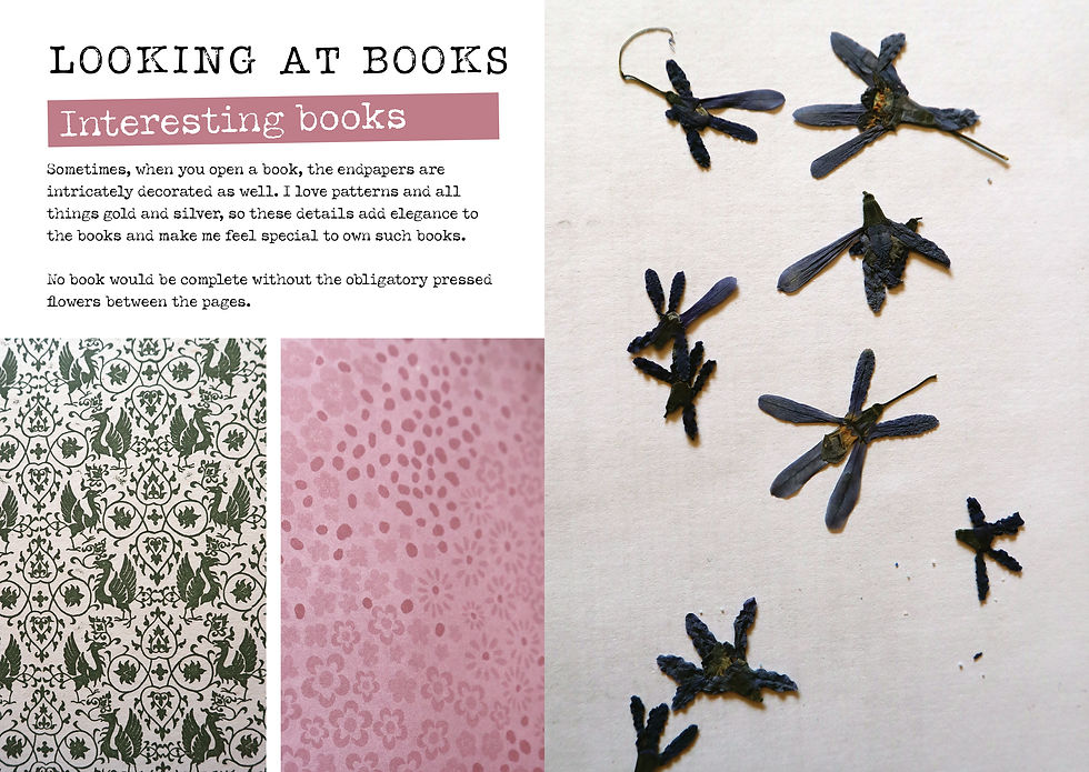
Looking at books - interesting books
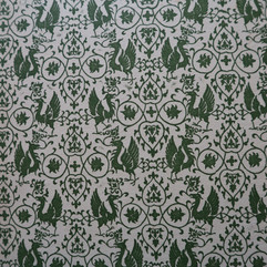
The most decorative books I have are either blank journals or Bibles. I find these books interesting because they are always adorned in such a special way. The edges have gold glint edges, often the title of the book is embossed in gold, nearly all of the books have beautiful endpapers and often the books have ribbons. All of these features elevate the books. I believe that you can't not like a book with all of these features. A book that is limited or a special edition can't disappoint.
Glint edging pin, gold and red and ribbons

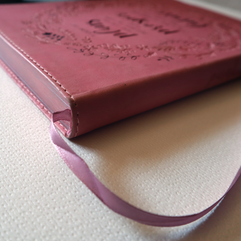


Endpapers


Embossing


With some of the big heavy books, I will always find some pressed flowers in between the pages, I thought this would be an interesting thing to add to my zine.

The final pages for my looking at books section of my zine.

Mock-up
I feel that this section should be at the beginning of my log, but felt it fitted better with the mock-up section. As a child, we always used to make paper Origami fortune tellers, where we would pick a number, then open a flap. Before I understood what this assignment was asking me to do, I thought this would be a cool idea! This would have worked as I needed to write about my favourite books. However, if it was for images only this would have worked.

My second idea for the physical format of the zine was to try a concertina fold.

Once I tried folding the papers together, I realised that I wasn't going to get 16 pages. I would have to cut to adapt to fit in the required number of pages. I was aiming for a digital approach and felt that this would be easier if it were handmade. At this stage, I don't think I would have enough time to do this assignment by hand.
I decided that working in A5 portrait would be the easiest for digital, and I could work in InDesign. I used my sketch book to work out with thumbnails what I wanted on each page and roughly how I was going to lay it out on the computer.

Final
Please click on the link to view my zine.
Reflection
Thinking about my zine was difficult at first. I thought that I was answering the brief incorrectly. The beginning was frustrating as I wasn't sure what I was being asked to do. After a slow start, I began to feel a bit more confident. I broke the task down into sections and brainstormed what I wanted to present in each section. It was a hard balance to explain what books I loved and why, and to share my personality with people so they could better understand me and my work processes.
I wanted my zine to be true to who I am and decided to take elements of the 1970s fanzines like the typography and "cutout" look, but merge those elements into a more updated version, like post-it notes in a handwriting style. My aim wasn't to make it look like a traditional magazine either, but more of a simple, clean, digital scrapbook version.
If I had more time, I would have created a handmade version of my zine in a concertina fold and would have achieved a more authentic cut-and-paste look.
References
Bibliography
Carle, E (2019) The Very Hungry Caterpillar. 50th Birthday edition. London: Penguin Random House UK.
Bartholomew, J. C. (1983) The Times concise atlas of the world. (5th Ed.) London: Book Club Associates.
de Villers, S. J. A. (1951) Kook en Geniet Suid-Afrikaanse Kook en Resepteboek. Cape Town: Cape Times LTD, Parrow Kaap.
Smith, D. (1982) Delia Smith's Complete Cookery Course. London: Book Club Associates.
Illustrations
Fig. 1 Carle, E (2019) The Very Hungry Caterpillar. 50th Birthday edition. [Photograph] In: London: Penguin Random House UK. p.15.
Fig. 2 Smith, D. (1982) Delia Smith's Complete Cookery Course. [Photograph] In: London: Book Club Associates. p.594.
Fig. 3 de Villers, S. J. A. (1951) Kook en Geniet Suid-Afrikaanse Kook en Resepteboek. [Photograph] In: Cape Town: Cape Times LTD, Parrow Kaap. p.179.
Fig. 4 Bartholomew, J. C. (1983) The Times concise atlas of the world. (5th Ed.) [Photograph] In: London: Book Club Associates. p. 69.


Comments