Exercise 7: Visualising, editing and critiquing
- Christine Griever

- Sep 27, 2025
- 7 min read
Based on your work from the previous exercises, think about how your designs within the context of the book. For example, visually explore how your artwork sits within the format of your A5 pamphlet - how the page might frame the artwork, how different pages sit together or how you might begin to develop a narrative across multiple pages.
This process might suggest new ways of presenting or developing your work. Think about how you want to finish your artwork, whether this is through typography, illustration, photography, drawing or another format.
Critique your work - what has the format of the pamphlet offered you, how might your ideas develop further, and how has your understanding of creative book design changed through this exercise?
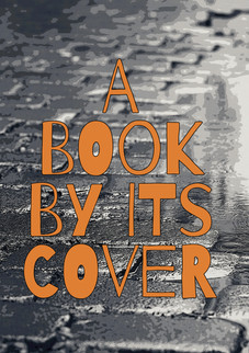
My image
I decided to start with this image from exercise 5, because I felt it would make a good story to translate into a pamphlet, with the sentence "You can't judge a book by its cover"

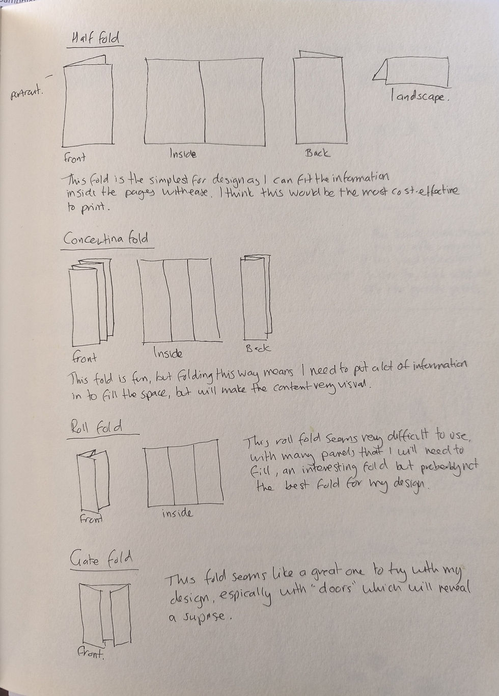
Types of fold research
I researched the different types of folds that I could use for my pamphlet. Click on the link to view https://app.milanote.com/1URAtp1zbjiddd?p=cva24oYydwP. There were many different folds, and I decided to concentrate on sketching out four of the folds.
A5 Pamphlet
In my sketchbook, I thought of the different ways I could fold an A5 piece of paper.
Valley/Mountain/Half fold - I could fold the paper in half, either portrait or landscape, to get a very different look. This meant that I had four pages to fill with my image and a story. I think for printing purposes, this would be the easiest and most cost-effective method.
Concertina fold - This is a very fun fold to do! Again, I could do this landscape or portrait. This fold gives me a very long and thin page, and also two extra pages than the half fold. This fold would be better if I had more information to put into the pamphlet.
Roll fold - This fold is quite complicated and to be able to put information onto the pamphlet will require the designer to be very organised, I think it would depend on the type of information that would go into this fold. This fold would also use six pages, I don't think that this type of fold would work for my design.
Gate fold - At first glance, this fold looks quite complicated. However, I liked that I could use this fold like an unfolding or what's coming next. This concept was a good one for the design I wanted to use. Although it uses six pages, three of the pages could hold one image.
Looking at the different types of folds made me think more about how I would place my images into the pamphlet.
Framing my artwork - Thumbnail sketches
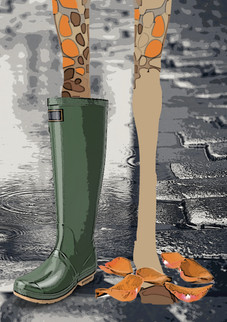
I moved on from the different types of folds and tried to visualise them in my sketchbook. I sketched out thumbnails to get a better idea of how I could utilise the pages. I sketched out a brief storyline to go with my image. This meant that I had to deconstruct my image in order for me to insert the sentence "You can't judge a book by its cover"
Rough Storyline
Front page - The wet cobbled stone street with a puddle in the background, with the words "Don't judge" This was intentionally left like this to make the reader turn the page to see why they shouldn't judge.
Inside pages - Once the pamphlet has been opened, there is an image of a giraffe wearing one Wellington boot, because it's raining and wet, the pattern on the giraffe has fallen off onto the floor. The rest of the sentence now reads "A book by its cover"
Back page - The back page has the giraffe prints left on the floor with the giraffe walking off in the distance.
With this rough storyline, I sketched how this would look in different folds. I found that depending on the fold, the more I could extend the story. For example, with the concertina fold, I felt I could play with the tallness of the giraffe by exaggerating the length of its legs by having the legs extend over all of the pages, until you reach the last page where you see the giraffe wearing a Wellington boot.
With the gate fold, I found that I could change the storyline slightly by having a pair of giraffe legs, but when you open the gate, it reveals a pair of giraffe legs with a Wellington boot. The fold allowed me to play on the element of surprise.
I found that depending on the type of fold, it would change the course of the story slightly to make it work for the kind of fold I was working with. Sketching thumbnails was very useful to visualise how I would place the artwork into the pamphlet, from doing this I could re-work the final storyline with my chosen format.

Developing my work
After sketching, I decided to use the A5 half-fold. Mainly to keep it simple and it was the best format to use for my storyline that I could turn into a pamphlet. In my next set of thumbnails, I could rework my image and place it into the pages to create a better flow. I could also get an idea of what I wanted my colour palette to look like and experiment with typography.

Critiquing my work
From my thumbnails, I could start to put it all together in Adobe. For this exercise, I used both Photoshop and InDesign.


Front page Inside pages Back page
I sampled the orange colour from the giraffe for the typography and chose a slab serif typeface (Rockwell super bold) to make it stand out and look bold. When I used green for the typeface, it got lost in the darkness of the grey cobblestones.
I then showed the layout to my family. They loved the image of the giraffe losing its pattern to the wet and rain and they liked the colours and the contrast of the dark cobblestone streets with the comedy-like fun style of the giraffe. However, they weren't sure that the wording was in the correct place and maybe I should put the words closer together. They weren't great at articulating what was wrong with the pamphlet, but the wording needed to change.
Editing
I went back to make some changes to the typography. I decided to use a different typeface this time, Barrio, as it was more fun and matched the playfulness of the giraffe. The different weights on the letters made it interesting to look at. On the first page, I moved the words around so it was easier to read. I also added an exclamation mark to capture the attention.
These were my changes.


Front page Inside pages Back page
I felt that the changes I made were an improvement on the first draft. I'm glad I changed the typography as it made it feel more fun and it was easier to read with the words closer together.
Mock-up
I put the final images into a mock-up to see how this would look if it were to be printed.

I'm very happy with the final result.
Reflection
When I read this exercise, I wasn't sure how to approach it. Eventually, I had a brainwave and got stuck into the exercise. I found that deconstructing the image made it easier to tell a story by creating a rough storyline. By exploring the different types of folds I could use, I could eliminate different folds and choose the one that would be best suited for my storyline and deconstructed image. In this case, I found the simple A5 half fold to be the best option due to the amount of information and material I had to work with, although using a concertina fold vertically would have been a very different approach, with a play on the tallness of the giraffe spanning the pages.
Producing thumbnails to visualise how the image could work in different folds was very helpful for me.
I could then develop my chosen A5 fold further in my sketchbook to see which colour palette and typography could work with the image and the story. This was also very helpful because I could get my ideas down on paper to visualise them before transferring the ideas to the computer.
For the first time in this unit, I was asked to critique my design. In my case, I just asked my family because it was easier and they are perhaps too honest in their opinions! Although I have done this process many times in my Graphic Design module, it is still daunting to have people give feedback on your work. I think that sometimes the word critique is confused with criticism, when in reality I'm asking people if they understand the design and the look, they are not intentionally looking for mistakes or problems. This was a good exercise to do because I could make changes to the first draft of my design to improve it.
After making my changes to the draft, I could produce a mock-up of how the final pamphlet would look. I enjoy creating mock-ups of designs, as it gives people a much better visual representation of how the final product will look.
This exercise definitely made me think about the format and types of folds that I could use. Choosing the correct format is essential, as it can make a big difference to how the work is presented.
References
Bibliography
Ambrose, G. and Harris, P. (2017) Basics Design: Print and Finish. (1st ed.) Bloomsbury Publishing. At:https://www.perlego.com/book/391789/basics-design-print-and-finish-pdf (Accessed: 15/08/2025).
Envarto (2023) What are the different types of brochures. At: https://design.tutsplus.com/articles/what-are-the-different-types-of-brochure--cms-37036 (Accessed: 15/08/2025).
Witkowski, T (2011) Paper Folding Templates for Print Design: Formats, Techniques and Design Considerations for Innovative Paper Folding. F+W Media, Cincinnati.
Images
Fig.1 Witkowski, T. (2011) Stepped accordion. [Diagram] In: Witkowski, T. (2011) Paper folding templates for print design: Formats, techniques, and design considerations for innovative paper folding. Northlight. p.15.
Fig. 2 Witkowski, T. (2011) Roll fold. [Diagram] In: Witkowski, T. (2011) Paper folding templates for print design: Formats, techniques, and design considerations for innovative paper folding. Northlight. p.19.
Fig. 3 Witkowski, T. (2011) Vertical fold. [Diagram] In: Witkowski, T. (2011) Paper folding templates for print design: Formats, techniques, and design considerations for innovative paper folding. Northlight. p.19.
Fig. 4 Witkowski, T. (2011) Gate fold. [Diagram] In: Witkowski, T. (2011) Paper folding templates for print design: Formats, techniques, and design considerations for innovative paper folding. Northlight. p.17.
Fig. 5 Ambrose, G. and Harris, P. (2017) French fold. [Diagram] In: Ambrose, G. and Harris, P. (2017) Basics Design: Print and Finish. London: Bloomsbury Visual Arts. p.7.
Fig. 6 Envarto (2023) Z- fold [Diagram] At: https://design.tutsplus.com/articles/what-are- the-different-types-of-brochure--cms-37036 (Accessed 15/08/2025).
Fig. 7 Ambrose, G. and Harris, P. (2017) Valley fold. [Diagram] In: Ambrose, G. and Harris, P. (2017) Basics Design: Print and Finish. London: Bloomsbury Visual Arts. p.7.
Fig. 8 Ambrose, G. and Harris, P. (2017) Mountain fold. [Diagram] In: Ambrose, G. and Harris, P. (2017) Basics Design: Print and Finish. London: Bloomsbury Visual Arts. p.7.


Comments