Assignment 5: Your choice
- Christine Griever

- Apr 11
- 11 min read
Your final assignment asks you to draw on all the skills, insight and experience you have gained so far, by designing and producing a book of your choice. Use the following options to as a starting point or alternatively identify your own project.
● Influential book designers
Identify one or more book designers to present through your book. Find ways to develop your own creative responses to their ideas and visual approaches. Delve into their work, find suitable quotations, investigate their influences, and find ways of communicating this material, and your
interpretation of it, to an audience through effective use of layout, narrative, and choices of material.
● Typography
Extend your exploration of typography by continuing to develop creative approaches to how typography, layout and your material choices can help generate meaning. Develop a book that explores one aspect of typography in more detail, or combines a variety of approaches. Just because your project explores typography it doesn’t mean you can’t also include images, colour and narrative.
● Found and altered books
Use an existing book as a creative starting point. This could be an extension of exploring altering books in some way, or as a research project into a specific book that will generate content and creative ideas for a new book. Find a physical book to work with or pick one of your influential books from Part One.
Research the subject in depth and think about the editorial structure (described in Part Three) of your book. What is the flow of the content, would you write articles or create imagery or both? What do you want to tell about the subject and how would you communicate this? And who is your audience? Make a flatplan before you start designing your book, and have a look at other books on the subject to see a different design approach on the subject. You may want to
look at the work of designers you inspired by, in order to develop your own design approaches.
You may have identified an alternative area you wish to pursue. This is fine as long as you check this out with your tutor first and document the reason(s) for your choice.
Follow the creative design process in developing your creative thinking and how you will approach the workflow, in terms of content and timescale. Decide on your subject and start researching, creating content, editing content, making decisions about the materials you want to use, and designing your book. Frame this process within an overview of your workflow to help plan the production of your book. Planning the process of generating content, and how this can then be developed, is key to successfully finishing a designed physical book. Keep notes
to accompany the process of making of the book in your learning log, and reflect on your design process.
You can use any medium or materials you want to in the production of your book. You may want to research and explore hand-binding, or work digitally with print on demand for production. You may want to combine these approaches and you may want to consider whether you want to produce a one-off copy or a small edition. If you would like to use a particular paper for your book, make print proofs before printing the whole final book. Test the paper, the colours and
how your design works on the paper.
Explore the materiality of books in more depth by considering the paper, printing and bookbinding of books, both as content and form. Think about how books are held, interacted with, and the associations of the materials you might use. Explore how these choices can start to create meaning within your book.
Reflection
Give yourself a final self assessment check against your assessment criteria to see how well you think you’ve done. Use this process to help reflect on your work and your achievements on the course as a while. It will also help to identify to you and your tutor any areas you may need to work on prior to submitting for assessment.
Found and altered books
For this assignment, I have decided to base my altered book on The Very Hungry Caterpillar by Eric Carle from my first exercise on influential books. I want to take the story and imagery from the book and adapt the physical book's interaction by exploring different folds and experimenting with introducing South African content and designs into the imagery and story.
The targeted audience will be children to be read with an adult, and instead of the book reading like a traditional book, I would like to experiment with a folded version. Since the book will have many folds the final book will be print on demand. However, for the content and imagery, I will experiment with different media, such as watercolours, collage and fabric to create a unique, creative look, with emphasis on South African artists and South African designs.
Brainstorming

Moodboard
I wanted to look at the themes of The Very Hungry Caterpillar with a South African twist. I looked at images of South African patterns, folds, colour palettes and springs to get inspiration and ideas for my pages in the book.

Folds
During this module, I encountered many different folds, and in my Exercise 3, Sequencing Images, I used the concertina fold to produce a mini booklet. I didn't want to do the same fold again for my final assignment, and I wanted to push the boundaries, so I researched unusual folds that could work with the altered book.
I came across an envelope book which I thought would be interesting.
I wanted to create a fold that would represent the size and movement of the caterpillar and came across this fold which I found online and I tried out different sizes.

I tried the different folds in different sizes because when held in your hands, they can be quite small. However, when you open the page, it grows, a bit like a pop-up book. The first image 75mm x 75mm open and 40mm x 40mm folded closed. The second image is 95mm x 95mm open and 50mm x 50mm folded closed.

The third image is 200mm x 200mm open and 105mm x 105mm folded closed.

The fourth image is 250mm x 250mm open and 125mm x 125mm folded closed.

All the samples folded open.
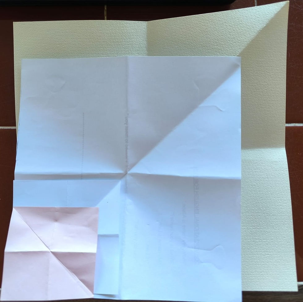
I decided that since the book is aimed at younger children, they will need to be comfortable holding the book. I decided that the 105mm x 105 mm closed would be the best option. I made 14 pages of the book to get an idea of the size and weight.


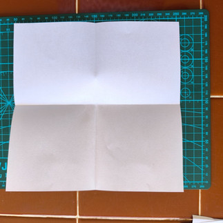


From A4 paper, I cut the pages into 200mm x 200mm squares. I then folded each page in half and again, so I had four squares on each page. I then folded the page diagonally to introduce another crease. I then folded each page down into 105mm x 105 mm individual pages.
To make my mock-up, I stuck each of the pages together to form a book, as you open each page, it extends into a pop-up page that opens up.


For this book, I don't need to do any special binding. However, I'm thinking of adding a ribbon to keep the book closed when not in use. The covers will be made of chipboard to improve the book's stability. This book will be printed professionally using the print-on-demand method on uncoated paper.
Research - Artist
When I thought of South African artists, my mind immediately went to the famous Esther Mahlangu.


Fig. 2 Esther Mahlangu1 (2020) Fig. 3 Abstract Image 2 (2020) Fig. 4 Abstract Image 1 (2020) Fig.5 A painting by Dr Esther Mahlangu (2018)
She paints her artwork with brushes made from chicken feathers (Wikipedia contributors 2022) (See Fig.6), and the Ndebele nation, which mainly occupies the provinces of Limpopo and Mpumalanga in South Africa, is well known for bright colours and geometric patterns painted on their houses and brightly coloured beaded jewellery. (See Fig.7 & 8 & 9)


Fig.6 Esther Mahlangu2 (2022) Fig.7 Beaded Bracelet 1 (2026) Fig.8 Beaded Bracelet 2 (2026) Fig.9 Decorated Ndebele House (2010)
In my sketchbook I experimented with drawing the patterns using the bright colours of red, yellow, sky blue, green and pink.

Then I moved the experiment to the computer using Adobe Illustrator and Adobe Photoshop. Which I printed and added to my sketchbook above.


Below is my sketchbook page with some of Esther Mahlangu's artworks and the Southern Ndebele language.

Storyline
I wrote the original story of The Very Hungry Caterpillar and needed to adapt it to fit the South African narrative. On the right-hand side, I made notes on the proposed story and how I would achieve it, using watercolours, collage and Photoshop manipulation.


Flatplan
My flatplan shows what I will put on each page. When opened up, the page will measure 200mm x 200mm.

Content Process
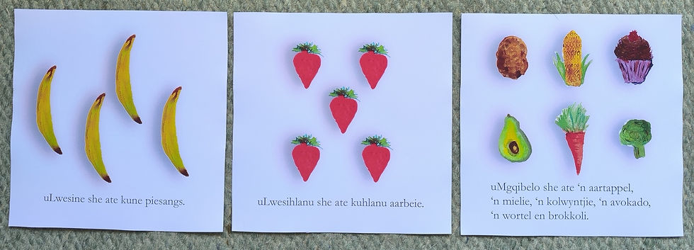
I was then working out the text for the story. In this story, I wanted to combine three of South Africa's 12 official languages. The majority of the text will be in English. However, I wanted to add isi-Zulu words for the days of the week and counting, and Afrikaans words for the different foods the caterpillar will eat throughout the book. Many South African's are bilingual or even trilingual, or add in different words from the different languages when speaking and I thought this would be a great way to introduce the cultures of South Africa into the book, along with the patterns and designs.


Page 1Endpaper/Title page
I used the Ndebele patterns for the title page in keeping with the South African theme. For the typeface I used Garamond Bold and regular because I wanted to still keep the original look from the original Eric Carle book.

Page 2
For this page, I took a stock photo of a leaf, removed the background and overlaid it with a green Shweshwe pattern. I then put in a watercolour of the moon and night-time as the background in Adobe Photoshop.


I used watercolours to paint the background and incorporated purples into the piece. For the moon, I used the blooming technique. Once I splattered the paint onto the piece, I used a fine brush to flick the blobs to create a shooting star movement.

I then added the Shweshwe leaf into the watercolour painting.
Page 3
For the sun, I used yellow Shweshwe with the patterns. I like how the yellows and browns and the shape lends itself to the shape and colour of the sun.

I painted the dark bronze earthy ground in acrylic paint. To highlight the shimmering African sun, I added glitter to emphasise the richness of the soil.

In my very first assignment, I made a Shweshwe caterpillar out of tissue paper and fabric, and created a collage. I decided to use this for my book, in a way, I started with this caterpillar and ended with her!

I then scanned my images into Adobe Photoshop and combined the images together to create page 2 of my book.

Pages 4-9
For these pages, the caterpillar starts eating through the food. I continue using watercolours to give the book and imagery a softer look and feel. I start to incorporate isi-Zulu and Afrikaans words into this section of the book.
I imported my watercolours into Adobe Photoshop to remove the background, maintaining the clean white background from the original book. I duplicated the fruits and vegetables as needed for the pages.


The only exception to the image was a cupcake I painted in a previous module, using a feather in acrylic paint in the technique of Esther Mahlangu.

Page 10
For this page, I used Adobe Photoshop to incorporate acacia trees (which I also used in my first assignment), representative of the African landscape, and the Shweshwe leaf I created on page one. I put all of these together to create the page.


Pages 11-12
For pages eleven and twelve, the process was quite straightforward. I edited the original Shweshwe caterpillar and adjusted the hue and saturation in Adobe Photoshop to create a brown colour to represent the cocoon. I then edited out the legs and facial expressions.


Page 13
For this page I choose the most colourful fabrics I had and cut up Shweshwe fabric into strips to make a butterfly.

I deliberately didn't make the butterfly symmetrical because one of the strips has a different pattern on the reverse, and I wanted to showcase all of the beautiful patterns. For some of the other strips, I instead changed the order of some of the colours. I imported the photo of my butterfly into Adobe Photoshop, added details and removed the background.

Page 14
I wanted to create a glossary of terms to help readers with the isi-Zulu and Afrikaans words used in the book.

Front and back cover
The front and back covers will measure 105 mm x 105 mm and will be glued to chipboard to give the book some stability. These pages will be printed on glossy paper.


Proofreading/Critique
The proofreading of the book was interesting, people enjoyed the different words and liked the diversity and inclusivity of the book. Usually, books will be in one language, it was useful to have the translations in the glossary.
Pages


Construction of the book
Each of the pages will be printed double-sided to include a Shweshwe design. When the book is open, it will look like this at the back, the idea that it looks like a caterpillar. Each folded page will be stuck to the next page, so when the pages are together, they will concertina like a caterpillar.


First printing proof
I produced my layout in Adobe InDesign, and once I was happy with the measurements and order, I turned my book into a PDF for professional print. I flattened the pages to ensure they would print exactly as they looked on the page. All the imagery was in CMYK and 300dpi. For this print I didn't include crop marks or bleed because I was going to trim the book myself in order to correctly do the folds.
I was so happy with how the pages printed. I printed the pages on uncoated 160GSM paper, double-sided with the Shweshwe pattern on the back.


I was nervous about folding the papers! In my excitement, I realised once I stuck my pages together that I had in fact made a mistake that affects how the book opens. I had folded the diagonal the wrong way, so my book opens awkwardly.


I need to re-print... :-(
After the re-print and construction, I added the green ribbon to help keep the book closed when not reading. The 2 images on the right, show what the book looks like when opened up revealing the patterns on the reverse of the book.


Final
Trying to take photos of the book was quite difficult, so I asked a retired teacher librarian to read the book, so you can listen to the different languages and the pronunciation and also see how the book works. My dog wouldn't move for the video, so she stayed!
Reflection
At the very beginning of this module, when I read through the whole course, I thought my final assignment would be on typography. However, as I progressed through the module, my mindset shifted. I was surprised because typography is one of my favourite design subjects. My point of view changed after completing assignment four, Altered Books. I found that I could create something tactile and usable that allowed me to interact with the book. I wanted to push this thought process further and experiment with folds and the interaction with my final assignment.
This wasn't an easy assignment to complete, and it certainly took me out of my comfort zone! I had printing challenges, mistakes and resolution problems. However, I am so pleased with the final outcome that I never would have thought that I would be able to produce my own book! I loved the creative process and bringing in my South African heritage into the book. I like how I can interact with the book, while still loosely keeping with the original storyline. I think I have adapted the book both physically and culturally.
I was able to combine collage, watercolour, acrylic paint, fabric and software skills to create a unique book from a South African perspective. I created a book with unusual folds, with coated and uncoated paper stock and the correct GSM.


Comments