Exercise 4: Printing
- Christine Griever

- Apr 11
- 7 min read
In this exercise you can use any images created elsewhere in the course, to print onto the paper samples you collected earlier.
Active experimentation
You are encouraged to be experimental in these exercises; it doesn’t matter if you make a mess or get things wrong in the images you make. It is important to reinforce this message at this point in the creative process, as often people tighten up when they think they are embarking on the final piece, and lose some of the fluidity and spontaneity of their original ideas. We want to keep the visual outcome of this exercise fresh and not stultified by perceived conventions of what is ‘right’.
When you’re exploring visual ideas and processes, the outcomes may not always be what you thought they would be at the outset. You won’t always get it right the first time, and this is how it should be. By repeatedly trying out and experimenting with the materials and ideas at hand, you’ll discover new ways of working. Occasionally ‘mistakes’ turn into happy accidents and prompt a way of working, or technique, that you might choose to deliberately recreate and integrate into your next project. For example, one colour may bleed into another, or your coffee cup might leave a stain on your working paper. Instead of throwing these elements away, you could integrate them into your design process.
Organising images
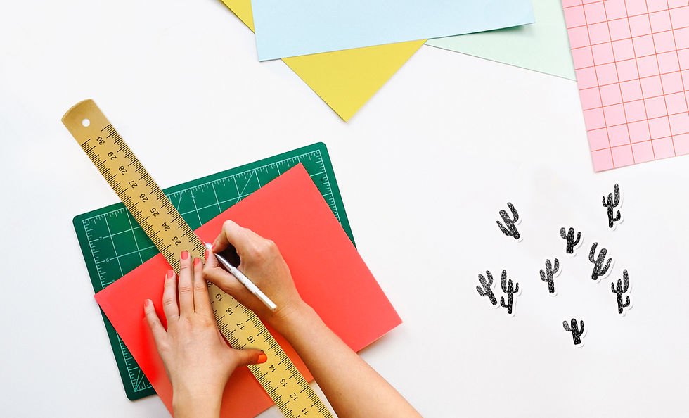
When you’ve created a set of images, scan or photograph these to create digital files – JPEGS or TIFFs on your computer. Make sure the resolution is set at 300dpi. Having gathered all the images together in one folder, consider how you’re going to print them. What order will the images appear in? At what size? How will the image appear on the page? Which paper will you use for which image? Do you have a particular image in mind for a particular piece of paper?
Will you try printing the same image on different sheets of paper? Draw a simple flatplan as a guide to working out how and where the image will be placed on the page, whether you will include any text, and to explore how the idea of ‘narrative’ might work. You might set up your page layout in DTP software, and work with your images digitally in this way, or you may simply print direct from your photo editing software onto the paper samples.
Printing
You may choose to use a desktop printer to output your images, or you may research other print methods such as screen-printing or etching. Print at least 16 pages using the images you’ve created on the paper samples you have collected.
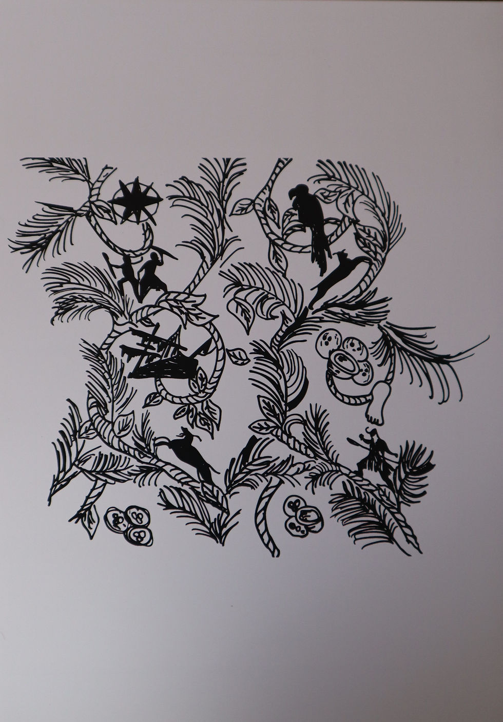
Chosen Image
I looked back at all the images I have produced in the module so far and decided to choose one from the Robinson Crusoe assignment.

I chose this image because I will be using a desktop printer to print on my different samples of paper stock. I also chose this image because it only uses black.
I wanted to use one image to experiment with and see which paper stock would work with it, and how different textures could make it look and feel different. I wanted the paper to be part of the design.
For some of the papers, I had to stick them onto normal A4 copier paper so they would feed through the printer.
The paper stock I chose was:
Newspaper
Tracing paper
Paper from a novel
Copier paper
Post-it notes
Card
Squared paper
Printer labels
Handmade paper
Map
Gift Wrap
Masking tape
Glossy paper
Brown paper bag
Textured paper
Coloured paper
Tissue paper
Flat plan
Since I used only one image to experiment with, my flat plan is more about the type of paper I will use to print from a desktop printer. My narrative will use the thinnest paper to the thickest, and, if I can, the lightest to the darkest in colour.

Printing
I used my saved image to print directly onto the paper. As in previous exercises, I was nervous about printing on my printer at work. I started with the tissue paper.
Although this was an experiment, I still had to be cautious about what type of paper I fed into the printer. I was scared that the paper would get stuck (which it did for the tissue paper below)
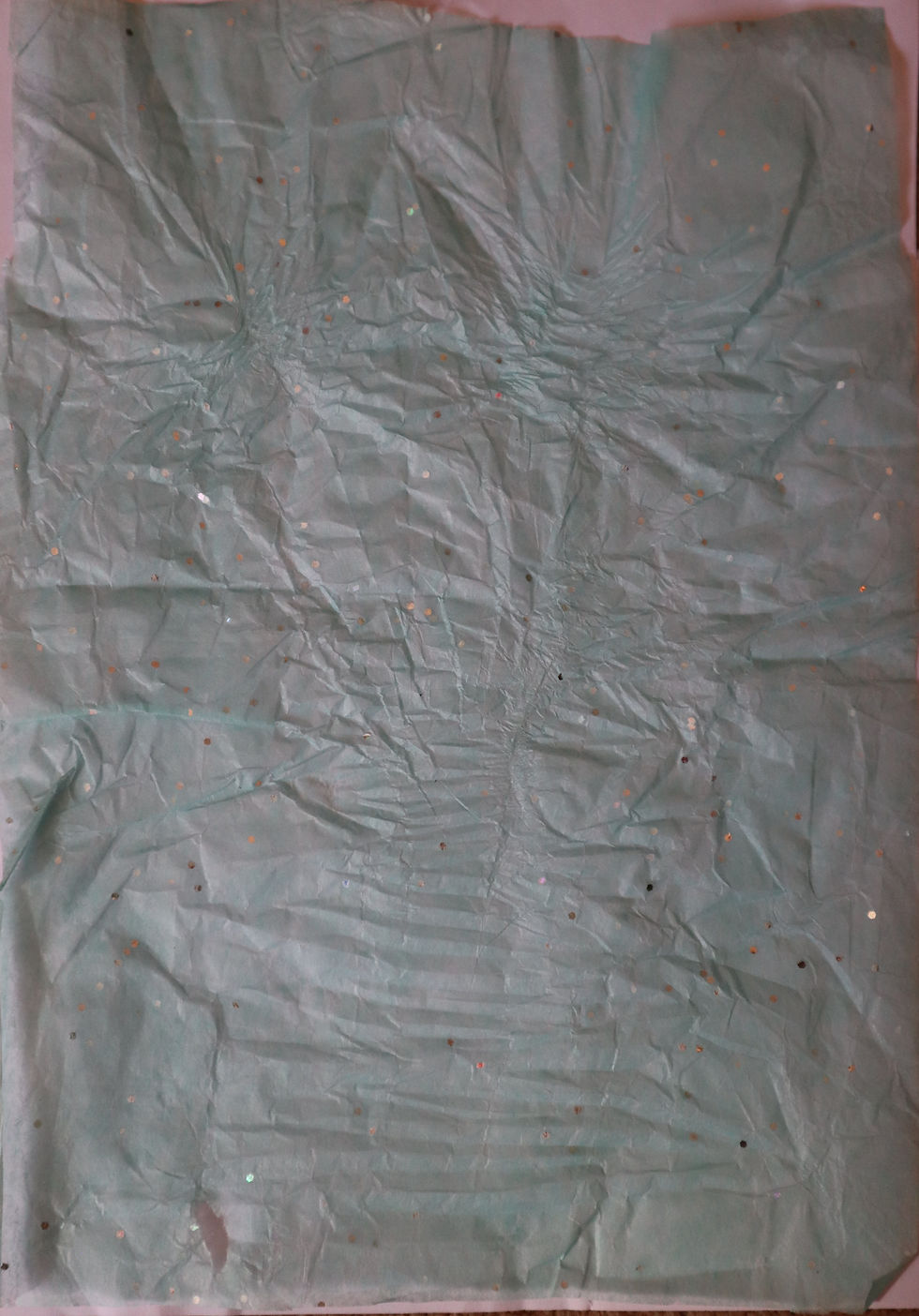
I scrapped the tissue paper and started with tracing paper instead.
Tracing Paper

This was one of the thinnest papers I had in my paper stock. This paper did get a bit creased in the printer, but I do like the way the lines give it a more rustic feel.
Novel paper

For this paper, I had to stick it onto A4 paper so the printer would recognise the format. I liked how the image bleeds over the paper. I also like how the image overlay on the writing gives it a different feel, as if it were part of the book's page.
A4 White copier paper

This was a straightforward print onto A4 white copier paper. I wasn't expecting anything amazing with this print. However, I could have perhaps printed it off-centre or off the page for a different look.
Squared Paper

Printing onto squared paper was easy. I like the patterns in the background that give the overall image a different feel. The contrast of the blue squares with the black ink gave it some texture.
Post-It notes

At first, I wasn't sure if the notes would stay on the paper. When it came out of the printer, it was sheer relief, but also thinking, " It looks so cool!" I like the yellow background. I can also experiment with using different colours and shapes of sticky notes.
Sticky Labels

Printing onto sticky labels was easy, as I do this all the time while at work. What I found interesting for this image is that I could make the image bleed over onto the other labels. So when I take off the label, it looks more like a pattern than an image.
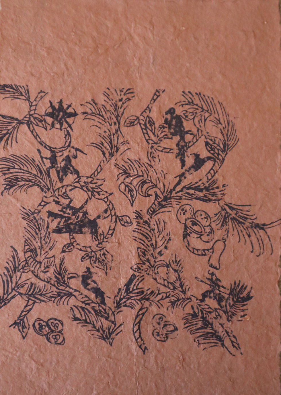
Handmade paper

Although I didn't foresee any problems with printing onto handmade paper, I was surprised at the final outcome. The texture of the paper gave the image a different feel, both visually and in its handling. This paper, in particular, has a strand of blue and red embedded in it, which gives the overall look more character.
Newspaper
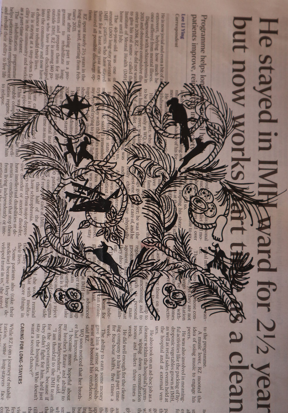
I was slightly nervous printing onto newspaper because it's so thin and absorbs a lot of ink. However, the print came out without any problems. It is a bit like the novel paper printing, but this has a different contrast with different typefaces and sizes, I'm not sure this worked as well, but it definitely gives the image a different look.
Map paper

I think this image is one of my favourites. I printed on a piece of old map paper. I like how the cool colour palette in the background contrasts with the black ink. I feel like it gives the image a more storybook endpaper feel.
Gift Wrap Paper

The texture of this wrapping-paper is very smooth, with a metallic strip finish. I was wondering if the ink would hold onto the paper or if I would end up with parts of the image missing. However, it did print onto the paper, and it almost has a wallpaper look; it is a very interesting contrast that works quite well with the image.
Masking Tape

For this paper, I used strips of masking tape to make a section for the image to print on. I'm not sure what happened at the bottom of the page, but the masking tape didn't hold the ink as well as I thought it would. Perhaps this was the ink that never made it onto the masking tape. It gives a washed out look, but I could perhaps see this working for making your own decorative tape.
Glossy Paper
I like how images look on glassy paper, especially when printing photographs or colourful graphics, it adds a sense of sophistication to the look and handling of the print. I think of luxury books or invitations printed onto glossy paper.
Off-white card

This card was a slightly different colour from the standard white card. It wasn't as smooth as the glossy paper previously and seemed to have smudged a bit at the bottom. But the grainy look gave it a more fanzine look.
Brown Paper Bag

I've never tried to print on a paper bag before and I loved how this turned out! I had to trim the bag down to size so I could print it, but it would have worked better with some typography on the image. I like how the brown contrasts with the black print.
Textured paper
I was unsure if this paper would make it through the printer as it's quite spongy and thick, almost like cardboard in texture. It made it through the printer and was printed in a rustic way, giving it a gritty look. I quite like this, but it might work better for more solid images instead of the intricate image I used.
Red coloured card

I chose a bright red colour deliberately because the rest of my samples are quite monochrome. The contrast is striking, giving the image an element of danger. If I'd used a cool colour such as green or blue, then the image would have had a different tone.
Reflection
This was a good exercise, as I learned that I can use many different types of paper and that each will give me a different look and feel. The type of paper used gives a gritty look when rough, like handmade paper, and the image comes out cleaner and crisper when used on smooth paper, like coated paper. I also found that the colour of the paper made a huge difference to the image's look; the coloured paper added a dramatic effect, depending on the emotion I wanted to convey. The red was harsh, if I wanted to give the feel of danger, compared to the printed map with the cool blues and greens that soften the look and create a calmer look.
I tried to make the narrative from the thinnest paper, like tracing paper, to the thickest card and also from colour, transparent to the boldest colour (red).
I wanted to use one image to see how it would look on different papers and how the look can change depending on the paper stock used.
It reinforces the point that choosing the right paper stock for a project or book is so important, because the tactile and printing qualities make a huge difference in how the book will be perceived.


Comments