Assignment Three: My Little Book of...
- Christine Griever

- Jan 26
- 9 min read
The brief: Create two books explaining and exploring the typographic and layout principles you have researched in this section.
Book 1: My Little Book of…Good Typography
Using the reference material that you’ve gathered throughout the exercises and research tasks in Part Three, design a book which explores traditional ‘good practice’ in typography. What is readability and, as a designer, how can you aid it? Visually explain the typographic principles that we’ve touched on in Part Three, such as type size, leading and line length. For example, you could demonstrate kerning by creating a page which looks at letter combinations applying this
principle. Equally, explore good layouts and use of grids to help support and frame your typography. This is an opportunity to develop carefully considered design layouts that feel easy and engaging to read, and look at. Be creative in how you do this, developing a range of options and possibilities. Show off your good typography skills as well as talking about what makes good typography in your text. To support this, find quotes and type rules by other typographers and designers - perhaps revisit your research into book designers from part two. Find
examples of good typography within book design you can present and talk about. Your booklet should be a celebration of good typography, whatever you think that is.
Book 2: My Little Book of…Bad Typography
The rules surrounding what constitutes ‘good’ typography are entrenched in tradition and convention, as you demonstrated in Book 1. Having looked at ‘the rules’ surrounding readability and legibility, now is your opportunity to break them! Be inventive and experimental in how you explore what might constitute ‘bad’ typography. For example, negative leading, too-long line length and ‘inappropriate’ application of typographic principles may produce visually jarring
and uncomfortable results. What does ‘bad typography’ mean to you and how might it manifest itself? Express your ideas in a visually imaginative way within your second book. This is an opportunity to be playful and push your design layouts, typography and ideas to the limits - celebrate bad typography through your designs and content. Again, find quotations you can work with or examples of bad typography to draw on.
Your books should each take the form of a simple eight-page booklet – folded, stapled or stitched. Design the cover and contents for each. When creating your content for both books, be aware of your audience, and how you might want them to engage with your content. While both these books are about typography, make sure you also include images within the text. These could be your own illustrations, photographs, or stand alone typography pieces that accompany your text.
Use a flatplan to organise your content and indicate where important text and images occur, on a recto (right-hand) or verso (left-hand) page, or as a double-page spread. Suggest images by a crossed box, as in the example for ‘front cover’ in the diagram on the previous page. These crossed rectangles indicate image boxes in desktop publishing (DTP) software, and are used in
drafts and sketches to signify image material. There is no need to go into detailed drawing regarding text or image material at this stage. Text can be indicated by a series of thick horizontal lines, with main headings sketched in.
Use the flatplan to familiarise yourself with the structure of a booklet. Note the blank pages and how they are organised to complement the preceding or following page. Note the extent (number of pages) in the book and whether it has been printed in signatures, or sections.
As with previous assignments, see this as an opportunity to undertake a creative project that is more circular in nature than linear. Visualise initial ideas, assess them and return to your starting point to develop new starting points. Be experimental with your typography and take creative risks along the way. Focus on how you can visually document your creative journey as well as your
reflections on what you are producing.
Your notes should cover why you decided to portray what you did, what you included and what you omitted. Reflect on how do you feel about the two completed books. For example, are there comparisons you can make between them, has any interesting design issues emerged through the process of making them?
Brainstorming
The brief: Create two books explaining and exploring the typographic and layout principles you have researched in this section.
I wasn't sure how to begin brainstorming since I would effectively be designing two books. I decided to divide the page into two sections: "My Little Book of Good Typography" and "My Little Book of Bad Typography," and I included the keywords from the brief. From there, I worked to expand my ideas.

Moodboard
To gather more ideas, I searched for visuals online and on Pinterest. I looked for small book-sized designs for inspiration, focusing on typography principles, illustrations and examples of poor typography. I organised the images into sections to help me think about how I would like to structure my little book of...
To see the whole moodboard, please click here.

Looking at small books
I needed to decide on the size for my books, so I searched the house for small books. The book's content didn't matter at this stage. I just wanted to get a sense of how "My Little Book of..." would look and feel in my hands. This exercise proved to be beneficial because it allowed me to think more carefully about the book's format.


Fig. 1 Collection of small books (2026)
Choosing size of book
I was drawn to the square format for my books, with the standard size typically being 200mm x 200mm. However, I felt that this was too large for a book titled “My Little Book of...” and decided to reduce the size to 100mm x 100mm.
To explore this idea further, I created rough physical prototypes using A4 sheets of paper. I’m glad I did this because it allowed me to evaluate the square format. After handling the size, I realised it might limit my content. A square book would be more appropriate if it contained many images, like a coffee table book or a children’s book. Instead, I believe the A6 version of “My Little Book of...” is the most suitable size. It’s compact, easy to hold, and ideal for small pieces of information along with images that would fit well in the layout.
Regarding the binding choice, since the book only has 8 pages, I would use saddle stitching if it was to be printed professionally.

Quotes
I searched for some quotes about typography to possibly use in my books:
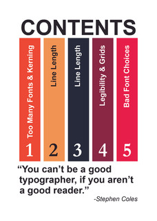
"You can't be a good typographer, if you aren't a good reader." Stephen Coles
"Typography is an art. Good typography is art." Paul Rand
“Typography is what language looks like.” Ellen Lupton
"Make it easy to read." Rodger Black
"Type design is about function. Drawing pretty shapes isn't enough." James Todd
"Your choice of typeface is as important as what you do with it." Bonnie Siegler
Researching Content
I reviewed all the notes I took during this unit and excerpts of information from typography books. I compiled all my notes into my sketchbook. While I don’t plan to use every typographic principle on this page, I will select the ones that I believe will be useful for my books.

Illustrations and Images
I began considering the idea of annotating my book with stock photos. However, as I tried to search for suitable images, I felt stuck and realised I wasn't heading in the right direction. Eventually, I decided to pursue a more illustrative approach instead.


While searching for small books around the house, I came across two books that I had completely forgotten about. Ironically, one of them is titled "The Little Book of Calm," and the other is "The Complete Tiny Book of Hugs." I took this as a sign to go with a more relaxed approach. I appreciate how the book features simple illustrations to convey its message. Looking back on my brainstorming notes, I remembered writing, "Make it fun."


Fig. 3 Examples of simple illustrations (2026)
I wanted to create my own illustrations, but lacked confidence in my drawing skills, and I was conscious of the time. I searched online for free images and recalled finding stick figures when looking for images for my moodboard.


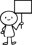


Fig. 4 Hand drawn stickman collection (2025)
When I think of it, I could have drawn them myself! However, I imported them into Adobe Illustrator and adjusted some of the characters' expressions to fit my book. I feel much better about the direction of my book and love the playful feel it brings.

Colour Palette
Inspired by the illustrations, I wanted to create a predominantly black-and-white "sketchy look" with the stick figures with colour accents. For each book, I selected a different colour palette (warm and cool colour palettes) while making sure that the overall design had a cohesive appearance, making it clear that they are part of the same series.
Colour palette for the "My Little Book of Good Typography" with cool colours to represent calm, clarity and success.

Colour palette for the "My Little Book of Bad Typography" with warm colours to represent caution, danger and alert.

Choosing a typeface
I plan to pair the typefaces for the books using Garamond, a serif font, for the body copy and Arial, a sans-serif font, for the titles. I will use various font styles within these families, including bold, italic and regular.
My goal is to maintain simplicity and readability throughout the books by following these typefaces. However, for illustrative purposes, I will use a selection of the typefaces listed below:
For the "My Little Book of Bad Typography"

"My Little Book of Good Typography"

Flatplan
As I was creating my flat plan, I wasn't sure about the exact placement of all my content, but I had a general idea of the titles and text. At this stage, I believe it's crucial to determine how many pages I have and identify where the main elements will be placed.

Setting up my file in Adobe InDesign
To design my books, I will use Adobe InDesign. I set up my file with three columns in A6.

Mockup
For the digital version of the book please see the link https://heyzine.com/flip-book/404584e706.html


For the digital version of the book please see the link https://heyzine.com/flip-book/fcd3bea309.html


Printout
I set up my document for 8-page quarto folding in mind and used a standard office printer to see how the prints would look on simple white 80gsm paper. The results were quite surprising! I'm usually not a fan of printing on paper unnecessarily because of waste, but this experience was an eye-opener for me. I was impressed by the quality that can be achieved with simple printing and low GSM paper. The only drawback is that office printers can't print to the edge (full bleed), so as a result, I have a white border around my book.


Printed on A4 double-sided.


Reflection
When I first read this assignment, I was so excited! I really love typography as a topic and enjoy exploring it further. However, I faced quite a frustrating start due to a complete creative block. I found it challenging not to be able to make a comparison within one book. Instead, I had to separate the contents into good typography and bad typography in two different books.
I also struggled with deciding which content to include. Should I duplicate content across both books, or use different content? These uncertainties slowed my production and creativity. It was only when I came across images of stick figures and searched for physical little books at home that an idea sparked and changed my direction. This inspiration allowed me to be more creative, make the books fun and even incorporate some humour along the way.
Choosing the format for the books also took some time. I don’t often experiment with physical mock-ups because I cringe at the thought of wasting paper. However, this experience taught me valuable lessons that were helpful not just visually, but also in terms of tactile experience and handling.
I found it surprisingly difficult to intentionally make the typography look worse! My brain kept telling me, “No, this is incorrect!” Designing a cover for “My Little Book of Bad Typography” was hard because I had to deliberately choose jarring typefaces and colours to illustrate the point.
I like how I made the books part of a set and the colour schemes I chose. I wanted the books to be black and white with accents of colour, which I incorporated in the pages as a vertical bar according to the content.
I really enjoyed this assignment once I finally settled on an idea and liked what I produced. I do regret not drawing my own illustrations, partly because I doubted my drawing ability and partly because of time constraints.
References
Bier, S. (2021) Type Tricks Layout Design. Amsterdam: BIS Publishers.
Caldwell, C. (2019) Graphic Design for Everyone. London: Dorling Kindersley.
de Soto, D. (2011) Know your Onions Graphic Design. Amsterdam: BIS Publishers.
Infinity Creative (2025) The 7 Deadly Sins of Bad Typography. At: https://infinity-creative.co.uk/the-7-deadly-sins-of-bad-typography/ (Accessed: 02/01/2026).
Lakolev, Y. (2022) 10 Common Graphic Design Mistakes to Avoid. At: https://www.zekagraphic.com/10-common-graphic-design-mistakes-to-avoid/ (Accessed 03/01/2026).
Yanchiy, N. (2025) Bad Typography Examples. At: https://www.todaymade.com/blog/bad-typography-examples (Accessed: 02/01/2026).
Images
Fig. 1 Griever, C. (2026) Collection of small books. [Photographs] In possession of the author: Johannesburg.
Fig. 2 Griever (2026) Prototypes. [Photograph] In possession of: the author: Johannesburg.
Fig. 3 Griever, C. (2026) Examples of simple illustrations. [Photograph] In possession of: the author: Johannesburg.
Fig. 4 FreePik (2025) Hand drawn stickman collection. [Images] At: https://www.freepik.com/serie/20856911 (Accessed 05/01/2026).


Comments