Exercise 3: Experimental typography
- Christine Griever

- Jan 26
- 4 min read
Below is an extract from Jules Verne’s 20,000 Leagues Under the Sea. Using a single typeface of your choice, lay out the text in as inventive a way as possible. Experiment with the letters and words, using the typographic principles you researched in earlier exercises to significantly alter the arrangement of the text, its rhythm and readability.
Think about design group Tomato’s definition of typography – ‘Sound as form’ – and how this concept might apply to your own work. Use the content of the text to inspire visual ideas. How might you experiment with the type to communicate something of the essence of the descriptive content? Think about how the designers you researched in the previous section, e.g. David Carson and El Lissitsky, would approach the text – or artists like Marinetti and Schwitters.
It is important that you play with the text, with individual letters and words. How experimental can you be in making expressive typographic designs? Can you reveal something of the character and nature of the letterform by experimenting with scale and orientation, so a simple unassuming letter becomes a monumental, almost sculptural form?
Think about the sound of the words you are working with, how can your typographic decisions help to communicate these? As a book designer, you might be more drawn to analog or digital ways of working. Whatever your preference, try to mix and match both approaches. Your work on paper might become a starting point for digital experimentation with this text, or print out your initial ideas, so that you can experiment with what happens when you start to cut, collage or physically alter your text in some way. This physical work can then be scanned to kick start a new digital stage.
Read the text through once before starting to manipulate the type. Make several designed versions of this passage, or parts of it, spanning several pages if need be. Feel free to focus on certain aspects of the text, or use the whole text within your designs. Use your learning log to reflect your creative decision making as well as sharing the various stages of your process.
Brainstorming
I read the extract from Jules Verne's 20,000 Leagues Under the Sea and took keywords from the passage to create a brainstorming exercise.

I was looking for words that best describe the sound as form, so I could use this concept in my work.
Moodboard
From brainstorming, I looked for images online that used typography in creative and artistic ways, along with designers such as David Carlson and El Lissitsky, who laid out their text in different and exciting ways.
Please click here to see the moodboard.

Sketchbooks
In my sketchbook, I wanted to try out writing the extract in the shape of waves. When I got to words like enormous and long, I tried to play around with the structure of the word to give the word a physical meaning.

I felt that I was trying to fit in too many words, so scaled down the amount of words and picked a paragraph from the extract.

This felt a bit more manageable to work with. I then started experimenting with different shapes. Here I wanted the movement from the squid.

I moved over to Adobe Illustrator and started experimenting with the typeface. I chose Garamond because it's a serif typeface with a range of fonts in the family. For the digital work I could use bold, Italic and regular. I felt Garamond was a good typeface to use to tie in with the story and also because of the serifs, I felt I could manipulate the text more by having more detail in the typeface.
Below are some of my experiments.

Taking the word long and changing the letters to convey the meaning.

Doing the same thing with the word enormous, using warp effects in Adobe Illustrator, below I used wave to make the words like a wave.

Here I am experimenting with more waves, emphasising the word enormous in bold and colour.

I experimented with type on paths with circles and different fonts of Garamond.

I then took all of these experiments and tried to put them together.

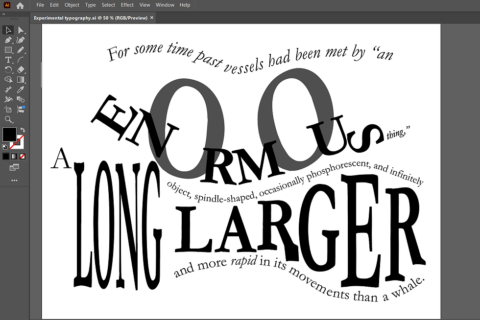
This was the finished typography section.

For the word enormous, I created outlines of the text and stretched them vertically to make the letters taller, I took advantage of the letter "o" and elongated it to help exaggerate the enormity of the word. For the word long, I also changed the text into outlines so I could emphasise the word by making it long, but still readable. For the word "larger", I took each letter and manipulated it to fit into the waves at the top and the bottom. I wanted the words to interact with each other to give the sense that the words were flowing like water and waves in the sea. I achieved this by using the text on path tool. To add an individual touch I made a sail from the letter "l" in the word vessels and the word "rapid" I used Italics to emphasise movement.
This was the final version.

Reflection
At first, I found this exercise a bit challenging because I was trying to fit in the whole passage. However, when I used a paragraph with the key words I wanted to manipulate, I found it was easier to produce a design that I felt was more cohesive.
I enjoyed that I could use Adobe Illustrator and brush up on my skills and try out new ones. I found sketching in my sketchbook at the beginning useful to play around with ideas of how I could get the text to look more like waves using sound as form once I identified key words that I could experiment with.
Once I moved over to digital, I found it easier to try out many ideas that I could expand on. Sometimes, when working digitally, I forget to take screenshots of my progress and how I got to the final design, as I get carried away experimenting with colours and composition!
I found that typography is artwork in its own right, and when designing, I don't always need an image or photograph, it can be made playful and is just as hard-hitting as images, depending on the project.


Comments