Exercise 3: Alternative publications
- Christine Griever

- Sep 27, 2025
- 5 min read
Using your research into artists’ books and fanzines as a starting point, think about their physical or design qualities, and creatively apply some of these approaches to your own designs.
For example, there’s a distinctive visual quality to many fanzines which comes from a ‘cut and paste’ approach to designing and through the use of cheap photocopying and printing. Punk fanzines in particular make a virtue out of having limited resources, no computers and little, or no, formal training as graphic designers. Use your sketchbooks to experiment with a similar ‘cut and
paste’ approach by cutting and collaging magazines and other material. What does this approach offer you as a book designer?
Alternatively, you can find other ideas you would like to test out in your sketchbook. You don’t need to make any finished designs, just give yourself room to experiment and try things out.
Brainstorming
I started by brainstorming keywords from my research into the fanzines. I decided to base the designs on the look and feel of the UK Punk scene from the 1970s, with, unfortunately, a more modern problem of GBV (Gender-Based Violence), which seems to be a second pandemic in South Africa.

I wanted to incorporate some of these keywords from my brainstorming into my sketchbook experiments.
Moodboard
Finding images online and newspaper clippings is relatively easy. With such vast information, it turned into a moodboard, which was not my intention. However, it was a good representation of the extent of the problem and the kind of ideas I could experiment with in my sketchbook. Click on the link to see more of the moodboard.

Sketchbook
I started off with a collage approach by printing out images and cutting and pasting with other images to see how effective it looked.

I started off with these images of two different women, the wired-up lips were so powerful I had to highlight this and keep the rest of the images grayscale.

I continued with newspaper clippings of GBV. This time, I wanted to include X-ray images to show the extent of how violent some cases can be.

In this image I used photoshop to remove the background from the three women and overlayed them with a newsprint background and stuck them into my sketchbook. I deliberately used a grayscale look and kept the lips red for it to stand out, like I did with my first experiment.

For this experiment, I tore out a page from an old book and blacked out the words, leaving words /sentences to describe a GBV theme.

I used the fractal mirror effect. I thought I would experiment with this look in my sketchbook using three different images cut vertically. I included an image (in colour) with an injury and grayscale images to give contrast.

I found an image of an eye and cut out the middle. I then used another image with a reflection in the window of the eye.

I found many images that had broken mirrors/glass. I found newspaper clippings online that gave grim statistics on the issue of GBV in South Africa.

In this image, I found a home scene from a magazine. I cut out the painting and used a greyscale hand with STOP GBV. On the chair, I rolled up a newspaper article and placed it on the chair. The point was not that everything is idyllic, and if you look closely, then you can see the abuse around you.

At this point, I felt I had explored enough of the cut-and-paste collage approach and decided to use a different medium: paint. In my sketchbook, I tried to do a handprint. I didn't mix the paint properly, and it came out watery. This flop actually made an accident with this page in my sketchbook.

While using paint to do the previous page in my sketchbook, I had left over paint and the result with red paint was quite disturbing-looking. While waiting for the paint to dry I looked up a recent news article and wrote down the main points.
"A nation at war with its women, children" - Ramaphosa
"3 women are killed everyday in South Africa (to GBV)"
"Our second pandemic"

This page was spontaneous and I used lipstick to "kiss the page" then with a tissue wiped off the Stop GBV (for a smudged effect). I realised that I was wasting perfectly good lipstick and then used washi tape for the cross over one of the lips.

I turned my attention to the typography. I experimented with cut-out letters from newspapers and magazines for the uneven, clashing appearance. Hashtags that are currently trending on social media are associated with GBV in South Africa. I also used a marker pen to write freehand phrases seen on photos I collected on my moodboard. I deliberately used the colour black to associate with unhappiness and the red to highlight the bloodshed. I went on to experiment with tape and the association with "keeping quiet" and "silencing." Justice for Cwecwe is, unfortunately, the latest high-profile child rape case.
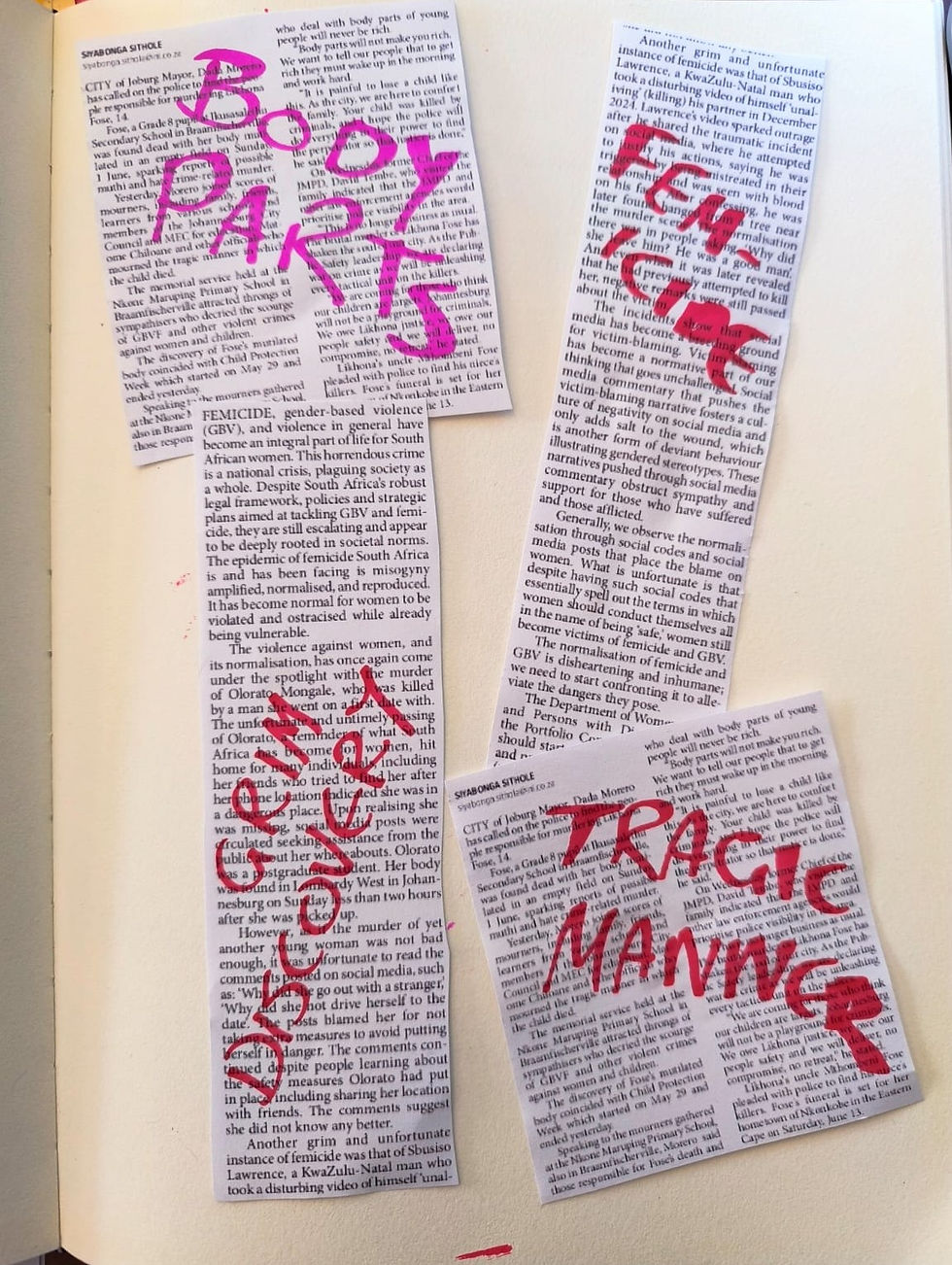
I printed newspaper clippings from the internet and continued the typography experiments by writing the keywords from the articles in red marker pen.

After all the previous experiments, I was just really mad and angry. Here, I used oil pastels in orange and red (angry colours) with quite a thick layer and then etched scratchy letters in pencil.
Sketchbook to Photoshop
After experimenting with different media and collage in my sketch book, I was quite curious to see what I would produce in Photoshop. My thinking was that I could manipulate the images and make them different sizes and colours. The results were quite striking.


I used Adobe Illustrator to remove the background and also to arrange the letters. At this point, I decided to keep the original colours and just use my handwriting. I didn't want to use the computer typefaces as I wanted to keep to the handmade look.

I then moved into Adobe Photoshop, importing all the images and removing the backgrounds to make a collage. Here, I changed the sizes of the images and text.
I then started to experiment with the different filters in Photoshop.

In this image, I applied a "stamped" effect filter.

In this image, I used the "cutout" effect filter.

In this image, I applied the "halftone" effect filter. However, in my layers, I kept the lips red to give a dramatic contrast to the rest of the image.
Reflection
This wasn't an enjoyable topic to choose for this exercise. However, one which is important to talk about. As I researched further and collected images, I became increasingly motivated to convey my emotions through an image.
I experimented with many different filters and stopped at the most dramatic. I could have produced many variations of the image. I was interested in how I could turn a collage image and freehand writing into something quite hard-hitting. Playing with the effects in Photoshop and experimenting with the grey tones with a hit of red was quite effective in communicating the seriousness of the topic of gender based violence.


Comments