Exercise 1: Type Samples
- Christine Griever

- Jan 26
- 7 min read
Find as many examples of type as you can from a range of sources, including newspapers, magazines, flyers, leaflets, online, and printed ephemera. Broadly classify them into serif and sans-serif groups. Explore your computer to see whether you have any of the typefaces mentioned on the previous page. Find other examples on your computer that relate to these classifications. Print these off and begin to create a collection of type samples.
Identify
Choose five different typefaces from your classification collection and now look for examples of how they can be used for reading in different contexts. For example, which typeface would be appropriate for a magazine, a science book or newspaper? Have you collected a typeface that might be suitable for all these subjects?
As a way of testing out which typefaces might be appropriate for a particular job, also consider them as inappropriately as you can - find contexts in which they don’t work, look ugly or feel ‘wrong’ in some way. Do this by experimenting visually with your typeface choices.
Reflect
Consider and reflect on the nature of the type you are collecting. Examine and annotate printouts with your own impressions of the letterforms. Use descriptive words that express something of the form and character of the typeface. Follow the same process for your ‘wrong’ typefaces as well.
Develop
Trace some interesting, unusual and everyday letterforms onto clean paper. This will help you to understand the distribution of weight of line within a particular letterform. Draw over the tracing to enhance the line and fill in the letterform with an even dark grey tone – HB pencil is fine – to recreate the impression of print.
Document and present
The work you produce for this exercise will feed directly into your assignment, so collate your notes, printouts, traced letterforms and samples of type you have gathered. Consider how these could be inventively and visually integrated, and how your ideas could be creatively developed further for your assignment.
Examples of type
My first task was to search for different types of typography. I have a box full of flyers, brochures, magazines and newspapers. It didn't take me long with my pair of scissors to start cutting for samples of typography.
I then got my A3 sketchbook and sorted out my sample cuttings into the serif group and the sans-serif group. I then went to my computer to look for the other categories of type referred to in the guide.
It is categorised into the following:
Old Style or Humanist: An extreme calligraphic type classification with minimal contrast between thick and thin strokes, a small x-height, and an inclined stress reminiscent of earlier letter forms drawn with broad-nibbed pens; also known as Venetian.(Poulin, 2017)
Modern: Flat serifs and thick and thin strokes are the characteristics of this serif type classification. (Poulin, 2017)
Square Serif or Slab serif: Distinguished by broad, bracketed or unbracketed serifs with square ends. (Poulin, 2017)
Sans-Serif can be sub categorised into: Grotesque late 1700s A Sans Serif type classification using characters without serifs, with varying stroke contrast, high x-heights and little or no stress on their rounded letterforms. (Poulin, 2017) Neo- Grotesque 1900s A Sans Serif typeface, stroke widths are consistent, contrast is high, apertures are closed, shapes are circular and terminals are horizontal. (Poulin, 2017) Humanist 1900s An analysis of the proportions of Roman inscriptions based on the Sans Serif type classification. (Poulin, 2017) Geometric 1900s Characters in this Sans Serif typeface have minimal stroke contrast and are based on geometric shapes such as circles, squares, and triangles. (Poulin, 2017)
Script: Has a handwritten appearance that can be casual or formal, which can be cursive with long flowing descenders. (Caldwell, 2019)
Text Letters or Black letter: It is also known as Gothic script, a style well known in the 15th century and the earliest printed typefaces. (Caldwell, 2019)
Decorative types: Are for aesthetic purposes only, for example, for titles or short headings, they are often very stylised with very limited font families. (Caldwell, 2019)
My computer didn't have all the typefaces. However, it was easy to find and download to my computer for reference. I could also add some extra typefaces to the list. I printed these out and stuck them in my sketchbook.

Identify
Garamond - Old Style
When reading a serif typeface like Garamond, the letters lead your eye from one word to the next, making it easier for the reader to read. Serif typefaces are popular in newspapers, textbooks and official documents, as well as in longer texts, because they are highly readable at small point sizes due to their well-proportioned x-height and short ascenders and descenders.
Didot - Modern
It is a serif typeface that has strong contrasts between thick and thin strokes. The typeface has a striking visual impact, grabbing attention with headlines and luxury brands like Vogue magazine. However, it can be very hard to read if used for long texts.
Rockwell - Slab/Square serif
It is a serif typeface that is heavy and grabs attention, which makes it useful for headlines and advertising in large sizes. It is not suitable for long texts as the thick strokes make it tiring to read.
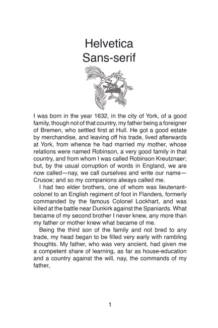
Helvetica - Sans-serif
It is a sans-serif typeface that can be used for nearly everything because it's highly legible. It has a vast font family and can be used for text, headlines, magazines and wayfinding signs. Helvetica has even stroke weights, making it neutral and simple to read.
Brush Script
It is a script typeface that gives the impression of handwriting, it is best used in lowercase for legibility. Brush script is best used for headings and for projects that need an emotional connection, such as invitations, a stylish and elegant logo, or promotional items like t-shirts.
Testing
I went into InDesign and took the sample page I created for assignment two, Robinson Crusoe book design. I took the first page and changed all of the body copy to the typefaces above. It was quite interesting to see how they looked on a page. All the body copy was set at 12pt and the difference in size was quite substantial. I also saw that the legibility was very bad for the brush script but very good for the Garamond typeface.


The best all-rounder typeface?
Based on the typefaces I identified by collecting samples and looking at them on my computer, I would say that Garamond is the best and most suitable for the following reasons:
It's legible and can be used in long bodies of text such as novels, textbooks, magazines and journals.
Can be read in small point sizes
The serifs are highly readable at small point sizes due to their well-proportioned x-height and short ascenders and descenders.
Has a traditional appeal that can evoke trust, used in luxury brands and logos.
When it doesn't work
The same sentence can have a very different meaning depending on the typeface you choose.


Trying to read either of these in a novel format is very tiring. It could work well if only used for the title for example the Old English typeface.
Reflection on Typography Styles
For this part of the exercise, I created a board where I could describe the structure and psychological associations of each typeface category, along with their effectiveness for use. While researching, I kept adding more and more information to the board. I found the process so fascinating and really enjoyed exploring typefaces and typography further.
Click on the link to see the whole board.

Develop
I took my A3 sketchbook and some carbon paper (I didn't have tracing paper) and found various words and letters I found interesting in magazines, leaflets and newspapers.
I was quite surprised by the various typefaces I traced. I found that there were many serif and script typefaces. I found it helpful to trace over the letters, as it gave me a much broader idea of how the strokes, contrast and, in some cases, serifs, make up the typeface.

Reflection
When I started this section on typography, I was incredibly excited, as typography is one of my favourite subjects in design!
I began the exercise by collecting different typefaces and categorising them as serif or sans-serif. However, I discovered that many subcategories exist and depending on the sources of information, the categories can become quite specific. As I searched for typefaces on my computer, I realised that the possibilities are endless.
I selected five different typefaces to test for a novel. After completing my second assignment, I used the sample pages from "Robinson Crusoe." I changed the typefaces and observed how each one appeared in a novel setting. It was fascinating to see how, even though they were the same point size, some typefaces occupied more space while others reduced the amount of space on the page. I learned that a typeface's readability significantly affects its effectiveness for long texts, such as novels. When I examined how typefaces shouldn't be used, I found it amusing that a single sentence, like "I will always love you," can completely change in meaning based on the choice of typeface. Using the wrong typeface could even lead to misinterpretation.
As I reflected on typography styles and described their structure and characteristics, I realised that typeface categories also have distinct personalities. For example, a serif typeface is often seen as traditional and trustworthy, while a sans-serif typeface is considered modern and clear. This made me realise the importance of typography when designing for a target audience or specific groups, such as children or luxury brands. Choosing the right typography is essential for communicating the intended message. Although I may have spent too much time researching this topic, I found it to be very useful and informative.
I also found tracing letters and words helpful, as it provided me with a deeper understanding of the anatomy of letters in each category. I was quite surprised to discover the amount of typography, especially in the serif and script styles.
Overall, I thoroughly enjoyed this exercise, learned a lot and can now apply my knowledge to my future designs.


Comments