Exercise 3: Sequencing Images
- Christine Griever

- Mar 21
- 5 min read
In this exercise you’re going to create images which you’ll then print onto the papers you collected in the first exercise. You have been working with the poem Tango With Cows in the exercise ‘Concrete Poetry’, to create an experimental text. Using your interpretation of the poem as a starting point, develop a set of images that you can sequence into a narrative. You can choose to create these images yourself or use existing images.
Idea generation
Create a series of images which will build a narrative sequence over about 16 pages.
Use keywords from the poem as a starting point. Work with images you have created before, developing and changing their contents, or use fresh new ideas and imagery related to the poem. Remind yourself of the creative design process.
Explore the sequential narrative over the folds. Produce a folding document (2sided) with the images you have created. Try one of the folding systems discussed in part two of the course, Form and Function: Paper folding.
Research and development
A visual narrative is a way of communicating some form of ‘story’. It may be that you interpret ‘narrative’ in a conventional way, using chronological images of how your identity has changed over time, with a beginning, middle and an end. Or perhaps you’ll work in a less obvious way, exploring how your images can be exploited through abstraction and print processes, using the term ‘narrative’ as a vehicle on which to hang your concept of the poem.
The purpose is to interpret the brief to create images that are meaningful to you, plus extend your understanding of image qualities. These images may be paintings, photographs, drawings, film stills – they can be at any scale, in any media and about whatever you want them to be, in the context of exploring the concept of the poem. This is your opportunity to explore some of the features of digital imaging software, such as Photoshop, to layer images, cut out images,
experiment with opacity, filters, hue, brightness, contrast and halftone screens, among other things.
For example, can we approach text as image? What happens if you ‘rasterize’ text, then begin to manipulate it, in the same way as you would montage image material. Be creative! Explore!
Remember you have access to Bridgeman and Oxford art libraries online also, if you want to download images and work in this way, but originating your own images will make the project more personal to you.
Idea Generation
Brainstorming
I brainstormed some of the keywords from the poem and added a few words which I think will give me more ideas, to look for imagery that will go with the poem.

Moodboard - Collecting Images
I collected some images from the Bridgeman art libraries and others from online stock imagery. Inspired by the previous exercise where I had to produce a design with the poem, I decided this would be my starting point for finding images that were quite abstract and by Russian artists from the same era as the poem.

Narrative
I decided to go with an abstract, non-linear approach to the narrative, so I took the keywords, found imagery to go with them, and put them into a rough flat plan to get an idea of the story's sequencing.

Paper-folding
I looked back at part two of the module to look again at the types of folds I explored earlier. I wanted a fold that was able to accommodate 16 pages, but also a fold that I could print on A4 paper (double-sided). I experimented with the accordion fold and another "Zine" fold where I could fit 16 pages onto one piece of A4 paper; these were the results of my paper mock-ups.
Accordion fold, double-sided.


A "Zine" fold that used 1 sheet of A4 paper.


I found that the zine fold was a good choice, as it saved paper and was cleverly folded into a mini booklet. However, I found that the pages would be too small for the images. I decided the accordion fold would be the best option, as it gives me more space for my images and spreads out to show the story. The only disadvantage is that I would have to stick the paper together to accommodate the 16 pages.
Research and development
Imagery
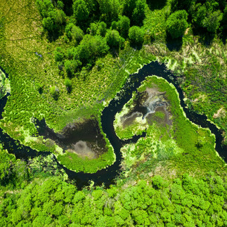
I wanted to fuse the work of some Russian artists, artwork from the 1920s with modern photographs.
In the Bridgeman library, I found these artists, which I thought would be a good addition to my story.


Photoshop
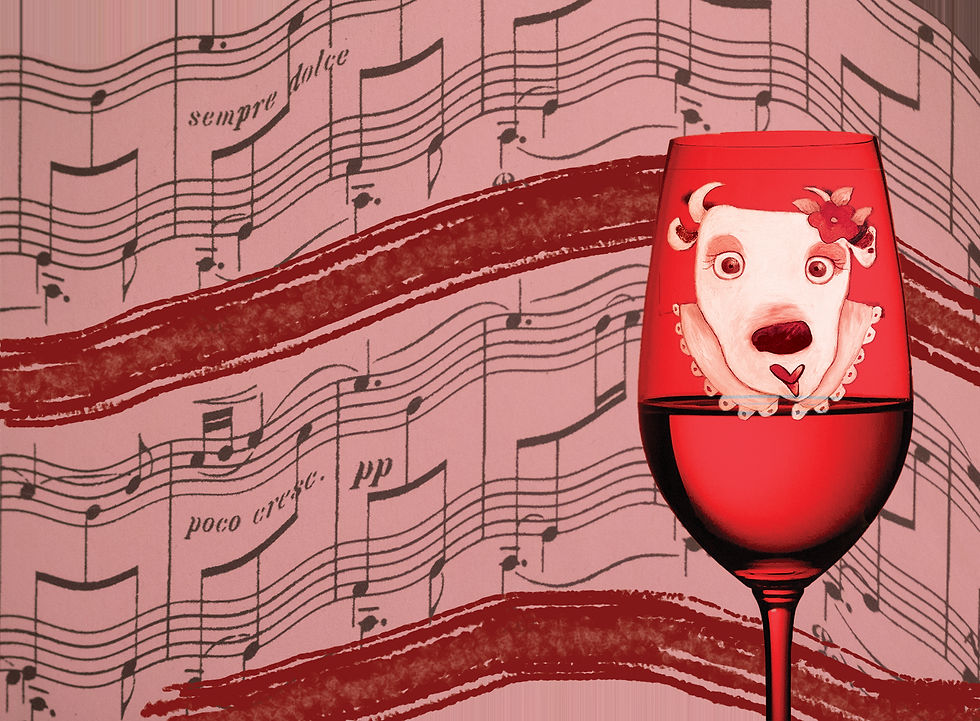
I used Adobe Photoshop to manipulate images for the accordion fold. For each page, I chose images to go with my narrative, removed backgrounds, adjusted hue and saturation, used the type on a Path tool for the text, applied blending modes and effects such as zig-zag and ripple and superimposed images. Below is how I selected the original images and turned them into the final image.
Page 1 from the previous exercise "Concrete Poetry"

Page 2-3


Final

Page 4-5


Final

Page 6-7


Final

Page 8-9


Final

Pages 10-11


Final

Page 12-13


Final
Page 14,15 & 16

Final

InDesign
Once I had designed all of my pages in Photoshop, I created images and imported them into Adobe InDesign. I then laid out the pages so I could print and fold in half and fold into the accordion.
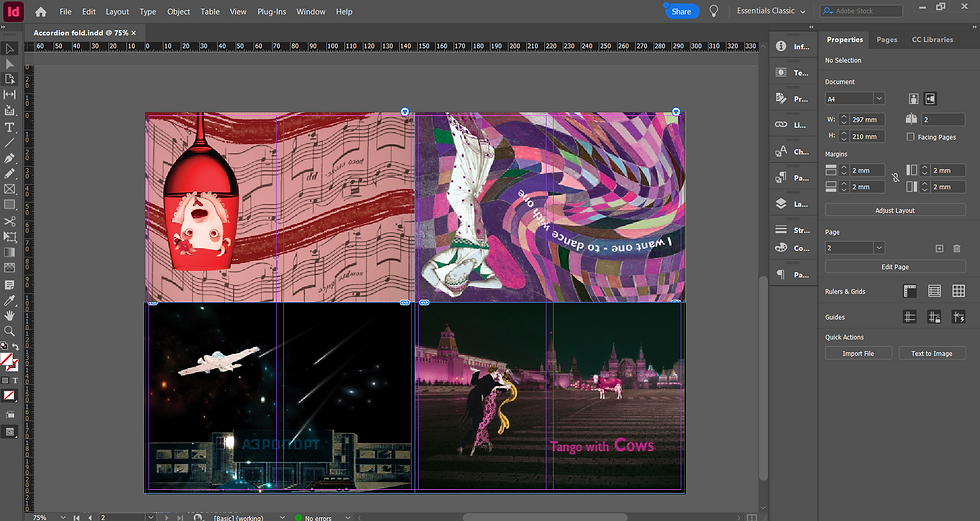

I printed the first accordion onto normal A4 80gsm paper, to test if I had put the images in the correct place.

I then folded again to create the accordion fold.


I was happy with the positioning of the images and the folding, but I needed to cut off the white edges for the final, which I did below, this time I printed on white A4 160gsm.


I then folded the card into an accordion fold and stuck the middle together to keep it continuous.


Reflection
I enjoyed this exercise because it challenged me to think about a storyline and put it into a sequence. My approach to the narrative was non-linear, treating the key points as images and manipulating them in Photoshop. I didn't necessarily put the poem in order, but I wanted a more abstract look to the final design, using a colour palette of pinks, purples, blues and black.
It was good to work in Photoshop again to familiarise myself with the tools I could use to modify the images. For the typography I wanted to experiment with the movement of the text within the image and used the type on path tools to create this. I also enjoyed masking the record player into the river bend to represent the river flowing into the city with modern music with the sparrow perched on the needle.
Choosing a fold was also a choice that stretched me because I had to work out how the final would be printed and how I would position my images in InDesign. I do think the accordion fold was the best for this design because of the number of pages I needed to answer the brief.
I am pleased with the final result and how it all came together.


Comments