Research Task 1: The Golden Section
- Christine Griever

- Jan 26
- 5 min read
The Golden Section, or Golden Mean, has been applied by artists and designers over the centuries to create harmonious formats for their work. In his extensive research, Tschichold discovered that many book designs were based on the Golden Section. Based on a mathematical formula, and directly linked to the Fibonacci series, the Golden Section provides a method of creating and dividing space that is a useful working framework for the book designer.
Look into the golden section more generally, by exploring how artists and designers have used these principles, and more specifically in book design, by looking at J. A. van de Graaf’s Canons of Page Design , Jan Tschichold’s grid designs , or other grid systems for organising the page:
Decisions regarding what sort of grid to use depend on the format and size of the book, the nature of the text and the image material. For example, a manual or text book may use multiple columns of text, with step-by-step illustrations. This content would require a different grid structure to a novel, which may use a simple single column grid to accommodate the text. Even with the simplest grid
structure like the one on the previous page, decisions need to be made about the width and height of the text column, margin widths and placement of folios and running heads.
Some books use no grid system at all; children’s books and fine art catalogues often don’t use a grid system, as the illustrations themselves predetermine the form the page will take. By contrast, the use of grids in newspapers and magazines is visually very evident.
It is good practice to have an underlying grid, to form a template for your book’s design. A grid provides continuity in terms of page layout; it ensures that body text, images and other elements are consistently placed and aligned throughout the book. A grid can be flexible, however, allowing you to adapt the size of text and image boxes placed within it. It doesn’t need to be ‘set in stone’; it can afford you flexibility as to how you arrange content, but with a solid underpinning
framework.
Depending on the book content and style, it may be that you have several grid structures in operation within the same book; these can be incorporated into different ‘Master pages’ in your DTP software and applied to individual pages as required. Once you have established a page grid you can then apply a more detailed ‘baseline grid’, which allows you to set the leading and arrange your text consistently.
What is the golden section?
Sometimes called the golden ratio, the golden section, or golden mean, the ancient Greeks observed that the proportions can often be found in nature and used in architecture and art. The golden ratio is based on a mathematical equation.

Scientists and artists such as Fibonacci and Leonardo da Vinci have also explored the golden ratio.
The spiral is then added to the golden ratio created by the rectangles.

I tried to make the golden ratio with InDesign and this is how it went. At first, I was getting confused, but then as I was measuring and adding the squares, it started to take shape. Once I had added the shapes, I overlaid the golden spiral on top to see if I was correct. It was quite a relief! But physically measuring and putting the golden ratio together made me understand the maths behind it much better.


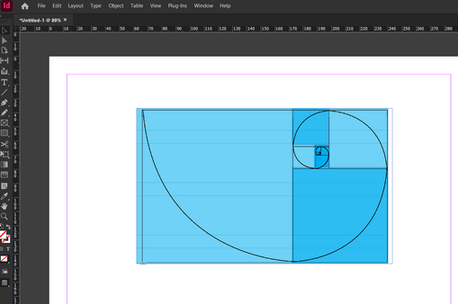
Screenshots of building my golden ratio.
The Golden Ratio used in Art and Nature
The golden ratio is known to be used in art because it creates visually pleasing art pieces. However, historians are not sure whether the golden ratio was applied to the artworks or merely discovered afterwards, once the masterpieces had been created. The golden ratio does create flow, visual harmony and balance to the viewer.
The golden ratio may be used in these artworks and in architecture. It can also be found in nature, such as sea shells, flowers and weather patterns.


Using grids in design
Manuscript Grids
It is a traditional grid system and one of the simplest. It is made up of a rectangle and is ideal for projects such as books, documents with large amounts of text and reports. This grid is very good at keeping the text aligned and readable.

Column Grids
Column grids are divided into vertical sections so that information can be read in sizable chunks rather than as a large block of text. This system is helpful for projects such as magazines, newspapers and websites, as it helps both illustrations and text flow more easily. The number of columns can be adjusted depending on the project.

Modular Grids
Modular grids are divided into blocks of the same size. This system is useful for more complex layouts or those with a lot of different information and content, such as websites and infographics. This grid allows for more flexibility when designing layouts.

Hierarchical Grids
Hierarchical grids are good at highlighting key elements and can be used in projects such as posters, web design and advertisements. Telling the story is more important than strict alignment and allows more freedom than other grids, creating more dynamic layouts.

Baseline grid
A baseline grids consists of evenly spaced lines (horizontal) to help with text heavy designs that need to be aligned across the page in either different columns like in a magazine or newspaper or in sections.

Rule of thirds
The design features a grid composed of nine rectangles. When divided into three sections, it becomes visually more appealing. The points where the lines intersect represent key focus areas and the most important information should be placed at these intersections.

Reflection
This research task uncovered more information about grid systems. I use some of the grid systems, such as the baseline grid, the column grid and the rule of thirds, and I have heard of the other systems but never really understood the golden ratio (not the mathematics of it). After experimenting physically with the golden ratio and trying to create my own template based on it, I found that it wasn't that bad, and I wish I had researched it more in my Graphic Design module.
Moving forward, I now have a much better understanding of all of the grid systems and the appropriate times to use them, depending on the project. Also, for content-heavy projects, like a novel, a manuscript grid is best. For lots of content with images and text, a column or modular grid will give me more flexibility to work on a dynamic layout.
However, it was refreshing to know that the grids are there to guide me, not set in stone as an absolutely rigid structure. There is flexibility to create pleasing layouts and push the boundaries. After visualising many examples of how the golden section works in art and posters, I'm even more keen to try this out in my next design.


Comments