Assignment two: Form and Function
- Christine Griever

- Jan 6
- 15 min read
Assignment two provides a creative opportunity to put into practice what you have learnt so far, by exploring the physicality of the book in relation to its function and working through the design process in relation to a set brief.
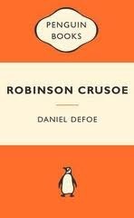
Your brief
Design the book format and cover artwork for two different versions of Daniel Defoe’s classic 1719 novel Robinson Crusoe . The publishers, Viking Press, have decided to re-release this title as a new pocket edition for readers on the move that reflects the adventurous nature of the story within a contemporary setting. This paperback version should have a modern visual feel that can compete with new titles in the bookshop. They also want a deluxe edition for armchair readers and classic book collectors that references the historical nature of the story and its associations. Produce book design ideas and cover artwork to reflect the content of the story across both formats and contexts. Be creative and inventive with both the look and format of these books.
As a side project to accompany the re-release of Robinson Crusoe, Viking Press has also asked you to design a new book called Washed ashore: The ultimate guide to surviving on a desert island by Rik Bennett. This is a ‘how to’ guide that should reflect not only the practical advice it offers, but something of the adventure of being a castaway.
The scale, stock and binding of these publications are up to you. The pocket edition needs to celebrate the functionality of the book as a lightweight, transportable object, and to connect to the story’s travel or survival themes in a contemporary way. The deluxe edition can present the content in a larger, finer, more luxurious, considered or expanded way, that perhaps makes reference to
the history of the book itself. Your designs need to be seen as part of a series across both versions, so think about how you adapt your designs to fit each format. The shipwreck guide needs to be seen as a separate genre, piggy-backing on the success of Robinson Crusoe . Develop visual ideas that can distinguish the survival guide from your Robinson Crusoe designs, while at the same time making some thematic connection between them.
Your design should include the front, back, spine and flaps of your covers - if you opt for a traditional book binding. You can also come up with alternative ways of binding, and therefore designing your books if you want to. Generate your own illustrations, photography or artwork for the covers, source copyright free images, or treat the covers purely typographically. This is an opportunity to be creative with both your design thinking and outcomes, so experiment, and test
out a range of visual and physical options.
You may want to extend your project by also designing a number of sample pages from the inside of the book. When creating sample pages, try to make a link between the cover design and the design of the inside pages. Present your ideas by mocking up each of the books and their covers, and by presenting the overall spec of your designs (what paper stock you are using, etc.).
Work through the design process, documenting it in your learning log as you go. Use rough drawings, notes, diagrams, mock-ups of your books, photographs of what you’re working on, and by saving different stages of any digital work to show your process. Talk about your creative process through notes and reflections.
Researching the story
When I read the brief for this assignment, I think I was quite overwhelmed by the enormity of the task. I broke the brief down into three books to get my head around the research and design processes I will need to complete for each book.
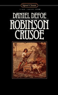
I have heard of the story of Robinson Crusoe, but I haven't read the book. I started by reading summaries of the book and the first chapter to get my thinking into the adventure genre. I also watched the 1954 movie that was loosely adapted from the book. The movie was more for the genre and feel than for the storyline.
(Robinson Crusoe, 1954)
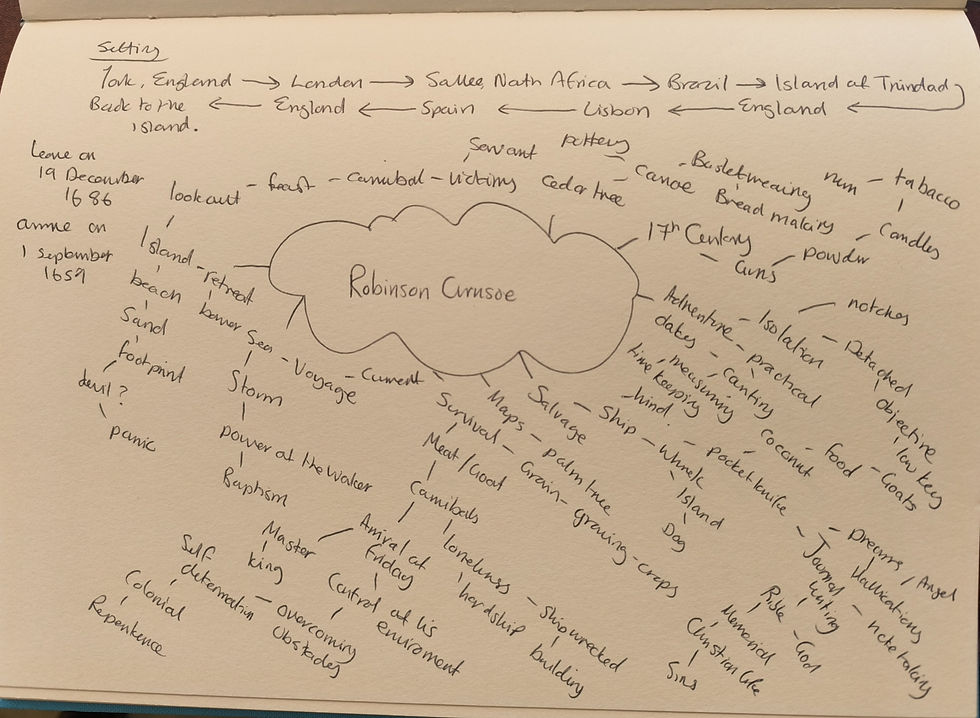
Brainstorming ideas
While watching the movie and reading summaries, I brainstormed keywords, objects and themes. Brainstorming words and themes is always helpful for me, as it sparks more ideas I hadn't thought of before. Below is my brainstorming exercise in my sketchbook.
Moodboard
From brainstorming, my next step is to do a moodboard. Having a visual board is also helpful because I can think about the colour palette, typography and overall look and feel of the genre I can expand on. What I wasn't expecting was to expand on patterns from the 18th century. I thought this would be a good direction to go into to tie in the old with the modern, perhaps a decorative border for the more classic version of the book cover.
Click here to see the whole moodboard.

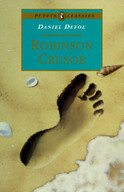
Previous covers of the book
As part of my research into the book cover and genre, I decided to look at past book covers of the book Robinson Crusoe.


1719 First Edition 1719 1891 1935 1961


1976 1982 1982 1994 1995


1998 2001 2003 2009 2010


2010 2012 2013 2016 2018
Fig. 1 Robinson Crusoe Book Covers 1719 - 2018 (2025)
I found looking at past covers of the book interesting. I found that the theme hasn't really changed ( I know the theme is adventure, island and shipwrecked) but all used the same motifs such as a ship, footprint in the sand, palm trees or a lonely figure on a beach. I'm wondering if I can push the boundaries further and not create a cliché.
The colour palette is very muted tones of grey, blue and green, with touches of orange and maroon. The typography used is mainly serif typefaces, I particularly like the gold embossing and glinting in the very early editions.
The book cover mainly features nautical-themed illustrations. However, a few editions feature patterns, which I want to explore further.
Adventure book genres
As the Robinson Crusoe books are specifically themed for a shipwrecked island. I wanted to look at other adventure-themed book covers to see if I could get some inspiration. I found that these books used a lot more typography, which was more prominent than the Robin Crusoe covers. I also liked how some of the covers had movement and a more vivid colour palette than the Robinson Crusoe covers.


Fig. 2 Adventure Book Covers (2025)
Survival Books, How to guides...
I went to my local bookshop to look at books that could inspire me for the side project, Washed Ashore: The Ultimate Guide to Surviving on a Desert Island. I was looking more at the structure of the books and the binding than the genre. I found some very different books that gave me ideas for the side project.
I discovered books that opened out from the cover, books fastened together with Velcro, maps that folded out to make a larger map, waterproof pages and spiral-bound books.


Fig. 3 Photos of guidebooks (2025)
Paper stock and Binding
While deciding which size to use for the paperback edition of the book, I was unsure if I understood the difference between pocket size and trade paperback. From reading online articles and information from printers, I found that the standard size varies by country. Since I live in South Africa, I decided to go with the trade paperback book size of 129 x 198 mm.
To select the book binding for the paperback edition, I would use perfect bound (EVA) as the most durable and cost-effective option, with uncoated off-white paper at 90 GSM. This is because the book needs to be portable and lightweight and not too expensive to produce.
For the deluxe edition book, I would use a hardback case-bound (with a cloth cover) for added luxury and tactile appeal for the reader. The paper stock would be higher GSM (uncoated) than that of the paperback book. However, with a whiter page look. The size would be larger, 156 x 234 mm, as the target market is people who read in their armchair, not those travelling on public transport. For added luxury, the hardback edition will have decorated endpapers.
The Washed Ashore book I would use is a spiral-bound one, because once it's open, it can lie flat if it's taken on an adventure! The spiral-bound book is also durable and portable, making it convenient for on-the-go use. The size will be A5, so it's easy to put into a bag for travelling. The paper will be coated paper because of the illustrations and images inside the book, with a GSM of 100 or more. This book won't have as many papers as the paperback and deluxe editions, so it will keep the overall cost of the book lower. The cover will also be glossy laminate to resist some moisture with a thicker GSM of 300 to give the book some sturdiness.


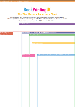


Fig 4 Standard book Sizes (2024) Fig. 5 Standard Book Sizes (2025) Fig. 6 A Graphic Overview of Sizes (2022)
Sketchbooks
From my brainstorming of keywords and collection of images for my moodboard, I was drawn to this pattern from 18th century wallpaper. I was drawn to this pattern because I like how the leaves weave with the flowers and the animals. I thought I could take this same concept and adapt it to make it look more like a stranded island theme.

In my sketchbook, I drew some of the motifs I identified in my brainstorming and moodboard that I thought I would want to put into my reworked pattern. I included very rough drawings of palm leaves, rope, cannibals, a ship, coconuts, a footprint, a goat, a compass and Robinson Crusoe.

Once I decided which motifs would fit into my pattern, I drew an outline version in my sketchbook. The branches became rope (for the nautical theme), palm leaves replaced the original leaf pattern, and the animal was replaced with a goat. I added in extra motifs to make the overall pattern more Robinson Crusoe.

I traced my design with a graphic pen to make it stand out more. I then transferred the image into Adobe Illustrator to make a PNG version of the artwork. When I uploaded my original image into Adobe Illustrator, I was quite disappointed with the image and decided to redraw it using the Adobe Illustrator tool. I realised very quickly that this was going to take me a very long time! I wanted a more refined version of my sketch, but realised that part of the charm of the sketch is that it is a bit rough and it was OK to have a non-perfect image.


Original sketch Final sketch after Adobe Illustrator Drawing from scratch in Adobe Illustrator
In my earlier exercises researching designers, I came across the designer Coralie Bickford-Smith. I was drawn to her design style and inspired by her updated take on old classics. When I saw this 18th-century wallpaper pattern, I thought of her design process and added my interpretation of the book in the sketch. This design is conceptual, as I have drawn motifs from the story and interlaced them with the 18th-century pattern, combining the elements to create an illustration that conveys the book's nautical symbols.
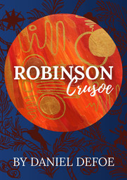
Deluxe edition book: Colour Palette and Typography
I wanted to use this sketch for the main image for the deluxe edition of the book. This edition of the book would be hardcover and cloth-bound to add to the tactile feel and give it a more luxurious feel. I found an image of the colour of the cloth I wanted to use. I chose this dark blue colour because it represents the blue of the sea. The inside of the book would have a higher GSM than the paperback book with uncoated paper and case bound.

I wanted to contrast my image as an overlay with a lighter blue or gold colour with the limited colour palette.

I did experiment with thumbnails in Adobe Illustrator to try different colours, typography and compositions. I found that using serif typography added to the elegance and tradition of the cover.
Eventually, I settled on the typeface Libre Baskerville.

Thumbnails
For the deluxe edition of the book, I finally produced these thumbnails. I used my illustration and overlaid it onto the cloth texture image. I asked family members which one they preferred, they said they liked thumbnail 3. Usually, I do take into account what people say about my work. However, this time I felt that having three colours instead of two lifted the book more, I preferred thumbnail 2.


Thumbnail 1 Thumbnail 2 Thumbnail 3
Endpapers
To add more luxury to the deluxe edition of the book, I decided to insert endpapers. I love endpapers in books, especially if they are decorated! Sticking with the old theme, I used my leftover tea bag with some coffee granules to create an old-looking paper.


I then imported the image into Adobe Photoshop so I could add my illustration as on overlay. I then used soft light to give a more rustic effect.

I wanted the colours to match the golds from the cover.

Sample Pages
When doing my research on the function of a book in previous exercises, for the type of book I am designing, the cover requires the front matter and back matter.
The front matter contains, Half title, Title page, Copyright page, Dedication, Acknowledgements and Accolades. The back matter contains the Author's bibliography, About the author and Accolades.
For the sake of this assignment, I will only sample the inside of the book with the following pages:
Title page and beginning of chapter 1. The assignment is asking me for the link from the cover design to the design of the inside pages. I have copied the text from Robinson Crusoe from the website Gutenberg and used the imagery from the book cover to flow into the inside pages. I kept the typeface as Libre Baskerville. However, I don't think this is the best typeface for the text. More research is needed for typesetting books, but for now, these are the sample pages to go with the book cover. I brought in the ship motif from the cover to the first page of the chapter.


(Defoe, 1719)
Mock-up


Front cover Spine Back cover


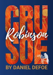
Paperback edition book: Colour Palette and Typography
For the paperback edition, I wanted to create a more abstract, expressive cover. I thought I would choose a contrasting colour palette to go with the deluxe edition of the book. I wanted to include orange because it's a colour associated with sunsets, and blue complements it because of the sea. However, I also wanted to steer away from clichéd versions of the cover, such as shipwreck imagery, and take an abstract approach to the paperback cover design.

For the typography, I wanted to use a sans-serif typeface as it's more modern-looking. I also wanted to pair the typefaces with a script typeface for contrast. The typefaces that I settled on were Roboto and Playlist Script.

Sketchbooks
For my abstract look, I remembered an exercise in my Key Steps in Illustration module. I created an abstract piece of work in which I listened to music and created a piece of work. I used acrylic paint and applied it with a wide brush to create a blending effect. Instead of blending horizontally, I applied the paint vertically as if heat were rising from the sea.
I added solid circles painted in bronze, gold and copper to symbolise the sun. These circles added shimmer, like being on a beach at sunset. I incorporated wavy lines with a gold marker pen to further represent movement. These lines captured the energy from the sun and heat.
I felt that this was a perfect piece to use for my paperback cover.

Thumbnails
I created different versions of the cover using this artwork and incorporating my illustration from the hardback cover to reflect the story's content across both formats.


Thumbnail 1 Thumbnail 2 Thumbnail 3 Thumbnail 4 Thumbnail 5
I had so much fun with these covers as I changed the colours and typography, bringing a different look and feel to the more classic hardcover version. Again, I asked my family which cover stood out the most and would catch their eye at a book shop. They liked thumbnail 4. This time I went with the majority, which was interesting because the other thumbnails all used majority serif typography.
For thumbnail 4, I created a contrasting blue background and orange oversized letters with touches of gold and white. I also contrasted the two typefaces, one with oversized typography (which I was concerned wouldn't work (because of readability issues) filled in with the orange abstract art. With the playlist script overlaid. To bring in elements of the hardback deluxe cover I brought in sketches of my illustration of the parrot.
Mock-up


Front cover Spine Back cover

Washed ashore: The ultimate guide to surviving on a desert island.
The design of this book was quite tricky because the brief was quite...brief! I wasn't sure who the target audience would be, whether the book would be used for their adventures, or if it would be a book about how to survive on a desert island. I decided to go with a book for travel, a bit like a travel guide, so it needed to be portable and durable. This book, as explained earlier, would be spiral-bound to allow the book to lie flat.
This book was the last to be designed and drew on elements from the other books to add to this washed ashore guide.
Washed ashore: Colour Palette and Typography
Many of the elements from the other books were transferred to the washed ashore book cover design. The colour palette included gold and blue, but I adjusted the tones to match the stock photography I used (below).

I also incorporated some green into the colour palette to represent the outdoors and the island's look and feel. Overall, the colour palette is earthy.

For the typography, I used a sans-serif typeface, Gill Sans, and varied fonts within the family to add some variation to the text. I also included a script typeface Good Karma for the handwritten look. I used the script typeface on the paperback edition of the book cover and also to incorporate some handwritten notes, as I could envisage this guide having a notes section for the reader to write in. For the title, I played around with the FX settings in Adobe InDesign to create a more sandy effect.

Sketchbooks
Ideas for the washed ashore edition of the book, I wanted to take elements from the other books and incorporate them into the washed ashore edition. I did use stock photography for this edition of the book. I was looking for my own photographs from my travels around the world, but couldn't find anything in my stock that represents a tropical island.
To make the guide more user-friendly and approachable, I looked at icons and found many from the Noun Project to help me.


Fig. 9 Various Icons (2025)
Each of the icons represented a title in the body copy. The text was taken from a wonderful website called How to survive on a desert island I used this text for my how to guide inside the book.
I also used the tea and coffee-stained paper I made for the endpapers for the deluxe edition of the book for the cover of this book.

Thumbnails
This edition of the book didn't need a spine because it would be spiral bound.
I used Adobe InDesign to create thumbnails of the cover. This time I got so carried away with changing the composition and the layout that I forgot to take screenshots of my progress. However, I kept the sample spread inside the book but later decided it looked more like a magazine article.


I changed direction and introduced icons to make it more of a guide.


(Williams,2023)
Mock-ups


Front and back cover

Sample inside book
Robinson Crusoe books
I wanted to put all the books side by side so the whole collection could be seen together.
Front covers

Back covers

Reflection
This assignment was a mammoth task. However, I am very pleased with the outcomes of the books that I designed. My research took me in many different directions, and I feel that my approach to moodboarding and brainstorming leads me to other ideas I wouldn't have initially considered.
One of those ideas was looking at 18th-century wallpaper. I was looking for images for my moodboard on 18th-century designs, specifically the late Baroque era, and I came across wallpaper. Wallpaper has nothing to do with the Robinson Crusoe story, but it did spark an idea of how I could incorporate that particular pattern into motifs from the story.
As I moved on with the assignment, the wallpaper pattern inspired me to work on the deluxe edition first. I could imagine that pattern on the front of a book. Once I did a rough sketch in my sketchbook, I remembered the book designers from my previous exercise earlier in the unit. Coralie Bickford-Smith was one of the designers who took classics and brought in historical imagery and reworked classics into beautiful updated classic covers with a modern twist. My sketching took motifs from the Robinson Crusoe story and incorporated them into the reworked wallpaper pattern.
One of my favourite things about designing is using software like Adobe to refine ideas from my sketchbook. I like applying different typography, colours and layouts. which I often find much easier than drawing thumbnails manually in my sketchbook.
The deluxe edition also gave me ideas for being creative with the endpapers, and I could create tea- and coffee-stained paper to give the book a more old-fashioned look. Being creative with past work also helped me succeed with my paperback edition. Contrasting the orange with the blue and experimenting with typography instead of clichéd images of a shipwreck as the main image. I wanted to do something very different and push the boundaries of the paperback.
When designing the covers of the other books, I drew on elements from each and tried to weave the colours, style and some of the images through them. All three books look very different but share some elements, such as the wallpaper sketches and the colours.
I learned so much from this assignment by becoming more aware of which paper stock and binding would be most suitable for each book. This assignment pushed me to be more creative and use different approaches to my images, all of which yielded good results. I'm glad I tried to push away from the cliches and try to be bolder in my experimenting on paper and with the software.


Comments