Exercise 3 Book Designers
- Christine Griever

- Jan 6
- 12 min read
1. Undertake a combination of library and internet research into the following designers, identifying a number of book cover designs for each.
Reflect on their conceptual and/or expressive approaches to design. Write a very brief description of your selected cover designs and a brief overview of the designer - try to focus on keywords rather than long descriptions.
Do this in note form, using the designer and the chosen example design to
visually inform how the information appears in your learning log.
● Phil Baines
● Coralie Bickford-Smith
● Derek Birdsall
● Kelly Blair
● Irma Boom
● Suzanne Dean
● Julia Hastings
● Linda Huang
● Jost Huchuli
● Ellen Lupton
● Peter Mendelsund
● Paul Rand
● Paula Scher
● Jan Tschichold
● Wolfgang Weingart
Research on book designers
I researched the book designers on the list and found very different approaches to their work. Please click here to see more.

Compare and contrast
2. Compare and contrast some of the cover designs. For example, how does the cover of Peter Mendelsund’s Kafka series compare with Coralie Bickford-Smith’s gothic horror series for Penguin? Are these expressive or conceptual in nature? Are they both conforming to genre expectations, or
are they challenging them in some way? Do Jan Tschichold and Ellen Lupton’s cover designs have anything in common? Make a drawing, sketch or tracing of the covers you’re comparing to help give you a better understanding of the imagery, typography and arrangement within the design. Use your learning log to reflect on your comparisons, identifying which covers you think are the strongest and why.
Peter Mendelsund Coralie Bickford-Smith


Fig. 11 Peter Mendelsund book covers (2025) Fig. 2 Cloth Bound Series One (2008)
Peter Mendelsund
His approach is more conceptual and his designs are symbolic and abstract in style, featuring unique shapes that make the covers stand out. He uses modern typography, such as sans-serif fonts, in the book's illustrations, sometimes distorting or rearranging them. His genre style is more contemporary, as he combines abstract shapes and challenges the norms by pushing boundaries. He uses bold, contrasting colours within a limited palette. Overall, his designs are more intellectual than emotionally evoking.
Coralie Bickford-Smith
Her approach is very expressive and her designs include patterns that make the book cover very decorative. She uses serif typography (for the clothbound classics) that feels part of the book's illustrations. Her illustration style combines elements of the Victorian era with a modern twist, with bold, contrasting colours within a limited palette. Her designs create a sensory interaction for the reader with the book.
Reflection
I don't think one style is stronger than the other, as they both approach their designs in very different ways. However, if I were in a bookshop, I'm more likely to pick up Coralie Bickford-Smith's book than Peter Mendelsund's simply because it looks appealing (to me) and gives me a more tactile feel when I pick it up. I'm also drawn to the intricate patterns and colours in her designs.
Julia Hastings Irma Boom


Fig. 8 Julia Hastings book covers (2025) Fig. 6 Irma Boom books (2025)
Julia Hastings
Her approach is more conceptual and expressive, she creates designs that are bold, interactive for the reader and uses different paper stocks and textures. She uses modern typography, such as sans-serif fonts, in the book's cover, sometimes experimenting with the weight or rearranging them. Her genre style is very contemporary, challenging traditional publishing practices to create art with diverse bindings, constantly pushing boundaries. She uses bold, colours within a limited palette. Overall, her designs are very visual with emotional and playful engagement.
Irma Boom
Her approach is very conceptual and structural, and her designs make the reader think, as they don't fit the typical publishing format. She takes the book and makes it more physical; they are works of art in book form. Her design style is super contemporary and also minimalistic. The typography is experimental and fits the book's tone. Her books are very tactile and physically immersive.
Reflection
These two designers are very interesting because they both push the physical boundaries, but in very different ways. When I researched these two designers, I was quite engrossed in the approaches they took. Irma Boom alters the reader's perception of books, and Julia Hastings takes a more playful approach, using bright colours and encouraging the reader to interact with the book physically. For this comparison, I can't choose which one I like more, but I love the idea that I can interact with the book and be more part of the reading experience.
Paula Scher Paul Rand


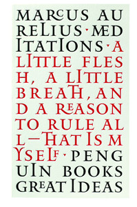
Fig. 13 Paula Scher work (2025) Fig. 1 Cover Designs for Penguin Books (2005)
Paula Scher
Her approach is expressive and conceptual, mainly featuring typography and high energy. She combines various typography weights and styles, using layers that reflect culture and boldness. Her typography is either hand-drawn or created using sans serif styles that fit into the overall visual layout. The colour palette is bold, with bright hues that create strong contrasts. These colours are often used more abstractly when combined with collage elements. Her genre mixes pop art with a modern twist and a playful, personality-filled style, giving a fast-paced, high-energy visual feel.
Paul Rand
His approach is more conceptual but minimalist, featuring mainly typography but with more restraint and structure. His style is very medieval and decorative, with a calligraphic feel. The typography is mainly serif, but it also uses sans-serif to push the boundaries in terms of weight, spacing, and scale. His colour palette is very subtle, and illustrations are seldom used, the typography is the image. He aims to create a clear visual for the viewer.
Reflection
Both designers concentrate on using typography for their designs, but both have very different ways of expressing themselves. It's interesting to compare two typographers. Paul Rand, influenced by the medieval era and Paula Scher, influenced by pop art, have visually distinct looks. In terms of which covers are the strongest, again I can't really choose, I like both looks and each one is right for the mood and tone they are trying to portray for their covers.
Further research into designers
3. Now, select three or more designers from the list that you are particularly drawn to, either because you like their work or because you don’t understand their approach, and research their design careers in more depth. Think about how they’ve responded to very different design challenges, whether they have an underlying conceptual and/or expressive approach, and how their work has evolved over time. Continue to use your learning log to record their work visually, explore these covers through drawing, and your responses in note format. See this as a quick fire activity rather than a long essay.
Paula Scher
1970s–1980s
Worked at CBS Records in the advertising and promotions department.
Worked at Atlantic Records as an Art Director, designing album covers.
She used historical typefaces in her design for the album cover as a revival of the historic style.
She needed to design for the band's genre but also make the album cover designs marketable, while still ensuring the band's identity was known.
Her design work for the album cover included decorative typography with bold images. The style was inspired by historical typefaces and Art Deco images.
Her designs had to appeal to the masses and they grab attention.
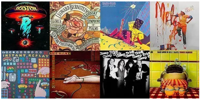
Fig. 16 Album covers (2025)
1990s–2000s
Worked at Pentagram, a design firm.
Had to create a brand identity for the Public Theatre in New York.
Had to rebrand the theatre to make more people attend and appeal to a broader cultural demographic.
Her designs are bold, urban and inclusive.
Used mainly typography of different weights, experimented with scale and alignment.
Broke away from the clean styles of the Swiss grid system and made her designs loud and more chaotic to match the pace of city life.

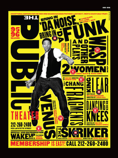

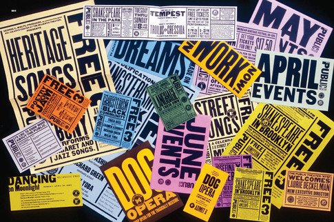


Fig. 13 Paula Scher work (2025)
2000s–Present
Started creating large-scale painted maps using typography.
Being quite expressive in using the information from maps and using art and typography to create a map with emotion.
Still using a busy, hand-painted visual approach, the maps contained lots of typography, and the paintings became a story.


Fig. 13 Paula Scher work (2025)
Reflection on Paula Scher
Looking back at her career, Paula Scher started in the corporate world, designing for clients. Her work was expressive and conceptual with the use of art deco-inspired images with historical typography. As she progressed to Pentagram, she started to use typography as a visual tool to communicate a more emotion-evoking response to the audience for her work for the Public Theatre. She experimented with bold type, exaggerated weights and a limited bold colour palette. In her latest designs, she has produced more visually emotional pieces where she hand-paints maps using typography, the result is a composition that is loud and chaotic but still communicates the message. Throughout her career, she has evolved from conceptual to more expressive concepts that now promote her self-expression.
Coralie Bickford-Smith
Early career
Studied at Reading University (Graphic Communication & Typography)
Worked for Penguin Books in the early 2000s
Had to re-design the Penguin Classic book covers for the modern audience.
To make the classic feel collectable and modern.
The book covers were inspired by the Victorian era, patterns with a limited colour palette.
The books were designed to be collectable and tactile for the reader with gold foiling.

2015- present
Starts to write her own books and illustrates them
Writes and illustrates a series of book namely "The Fox and the Star"
Inspired by William Morris with intricate patterns and details
More pattern than typography
More symbolism in her work
More expressive

Reflection on Coralie Bickford-Smith
Coralie Bickford-Smith is still early in her career, but has so far cemented herself as an award-winning book designer. Working for Penguin has given her a platform where she can take a series of classics and turn them into a modern collector's item. She uses conceptual elements in her designs, such as patterns, which serve as metaphors for the story's themes. She doesn't use illustrations very much in her work, as symbolism is used instead. However, she can be expressive in her work by using colour and texture, which makes the books feel more ornamental than just functional, especially when gold foiling is used to make the book even more special.
Irma Boom
Career
She studied Graphic Design at AKI Academy
First started working at the Dutch Government Printing Office
In 1991 she founded the Irma Boom office
She developed a reputation for developing an architectural form for her books.
Made books an experience instead of an object.
Lots of experimentation with binding, paper stock and the physical structure of the book.


Fig. 6 Irma Boom books (2025)
Reflection on Irma Boom
The first time I came across Irma Boom was while researching for this exercise. I was so fascinated with her approach to books that I wanted to research her more in this part of the exercise. I love the idea that she takes a concept of a book and makes it so interactive and immersive for the reader that it almost feels like she is creating a next generation of books, books that push the boundaries.
At the beginning of this module, we are asked a question: Are physical books being replaced by digital ones? Irma Boom proves that by changing and pushing the boundaries, books are still objects that can be enjoyed and read differently.
She can take the conceptual idea of a book and still be expressive in her design. Although her work is minimalist, it has so many tactile elements to keep the reader engaged.
Visually engaging book designers
Finally, identify at least three different book designers you find visually engaging. To do this you might want to visit a library, bookshop, or browse online. Identify who designed these covers and find out more about them. Try to work out why you are drawn to them. Is it to do with genre or their
approach to design? What is it about the design that captures you? What sort of imagery, if any, is used on the cover? How does the text relate to the image? What atmosphere or style does the cover evoke? Summarise your thinking in your learning log - focusing on the kinds of book covers
you are drawn to and why - and continue to document what these covers look like.
Monique Cleghorn


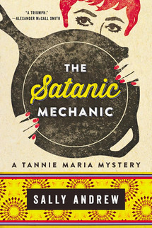

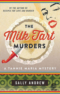
Fig. 18 Tanie Maria series (2025)
I'm drawn to this series because I wanted to showcase a South African designer. Unfortunately, I couldn't find much on this designer, but she designed the covers for this series written by Sally Andrew. The genre is a murder-mystery series revolving around an amateur detective, “Tannie Maria”, who writes a recipe/advice column and becomes involved in murder cases.
Instead of taking the murder-mystery theme and making it dark and mysterious, the designer made it more playful, since it is also about food, with recipes at the end of the book to try!
The design has a retro feel to it with illustrations mostly related to the cooking theme. The typography contrasts with bold titles and includes decorative elements to soften the tone. The colour palette uses warmer tones instead of a harsh, dark palette more associated with crime novels. This gives the covers a more nostalgic look and feel. The design captures me because the book integrates South African shweshwe patterns used in traditional clothing into the book cover.
Emily Gravett

While browsing in the bookshop I came across this book "The Forest of a Thousand Eyes" The designer is Emily Gravett.
The hungry Forest is moving forward like an army, a green and constant threat to the humans living in and on an increasingly crumbling Wall. Feather, accompanied only by her scaled ferret, Sleek, must avoid the Forest's tentacles, and the many dangerous creatures it shelters, to return the community's precious spyglass to its rightful place. Along the way, she develops her resilience, and meets other people living on the Wall, whose stories and experiences open her mind, and those of her community, to new horizons. - Frances Hardinge
I was drawn to the book because of the green foiling (I do love foiling on books) and because of the colour palette. Green is one of my favourite colours and I liked the contrast between the black and the shades of green. The colours integrate with the forest scene, with twisting vines and hidden animals.
The genre is fantasy, and the design gives it an eerie atmosphere, but elegantly illustrated with forest vines in a brighter green, which stands out against the dark background. The typography uses a serif font that integrates well with the book cover illustration.
I love Emily Gravett's illustration style and it reminds me of Coralie Bickford-Smith's style, with elegant illustrations and a limited colour palette and the use of tactile foiling on the cover.
Charlie Macksey

I remember when this book was first published and thought "It's quite hard to read the title" I then realised that this wasn't a story book but rather a book about important life lessons with Charlie's friends.
I'm drawn to this cover because of the illustration. I love the loose sketchy feel with ink instead of highly detailed work. The typography looks handwritten, and again with the metallics, I love the gold because it works with the limited colour palette of cream, white and blue. The gold adds a touch of warmth to the cover.
The illustration is simple but conveys the boy's interaction with the animals in the book. I love that the cover is simple, sketched with a limited colour palette. This makes the cover welcoming to all ages.
Reflection
For this part of the exercise, I went to the bookshop. I found that, in general, I was drawn more to the children's books, as some were special editions with beautiful foiling and illustrations. I suppose this makes sense because we want children to be interested in their book covers, and those covers are marketed to children. However, when I went to the adult section, I was quite disappointed with the covers. Nothing really grabbed my attention, and if it did, then the cover was computer-generated or AI. Why do publishers use illustrators and designers for children's books but not so much for adults books/novels? I was quite annoyed that the genres, for example, crime thrillers, all looked similar!
Overall Reflection
This exercise felt extensive and took a long time to complete. However, I did learn more about the different designers and their approaches to book design. The designers that I felt intrigued by were firstly Irma Boom, who pushed the boundaries of what a physical book can be, more interactive, physical, unusual, questioning the normal appearance and order of a book, even printing a book with no ink! I loved that she could experiment with the size of books, making tiny books, making the reader think about how to interact with the book. She proves that print books are not dying.
Then looking at the career of designer Paula Scher and how her style has evolved over the course of her career, from album covers to redesigning the Public Theatre branding and advertising to painting large-scale maps using typography as the illustration, shows the versatility of her work. I am especially inspired by her use of typography, creating bold and busy designs that cater for a larger inclusive audience.
I also loved Coralie Bickford-Smith's redesigns of the classics for Penguin. She uses bold, limited colour palettes, but at the same time using the influence from the Victorian era to make the covers more modern and eye-catching. I love the use of the tactile material. Her delicate style is one that catches my eye as I have a similar design style.
Completing this exercise has given me a wider view of how different designers push the boundaries and create unique books and covers.


Comments