Exercise 4: Designing a cover
- Christine Griever

- Jan 6
- 6 min read
Following on from the discussion of George Orwell’s novel 1984, look at the covers for Margaret Atwood’s equally dystopian novel The Handmaid’s Tale (1985), in which a woman finds herself surviving inside a harsh American fundamentalist society, that sees women’s roles as subservient cooks, matrons, and mothers. Alternatively, you can pick a different book to respond to, but it
needs to be one with more than one cover design, so avoid recently published books.
Are there key conceptual motifs being used over and over again within different cover treatments? Can you identify more expressive versions of the covers? Check the date of each version and try to speculate about the historical, political or social context for each one. (Don’t spend long on this but it’s important to realise that creative design doesn’t happen in a vacuum.)
Using one of the main motifs you have identified (such as the uniforms that feature the book), the title of the book, author’s name, and no more than three colours (including black and white), generate as many different layouts of the cover design as you can. Think about how you can dynamically layer, organise, frame, clash, or balance these elements. Work quickly and come up with lots of different visual possibilities.
This is a similar exercise to the Lightbulb Project in Graphic Design 1, which aims to generate quick design possibilities by arranging your typography, motif and colours in as many, and as varied, ways as possible. Examples of students’ responses can be seen here:
Use thumbnail drawings or DTP layouts to achieve at least ten fundamentally different layouts. This is a warm up exercise that will help you with your approach to designing a cover for assignment two.
The Handmaid's Tale - Past covers
I haven't read The Handmaid's Tale. So I researched the summary of the book and watched the first episode of the TV adaptation online, to get an idea of the feel and the idea of the story. I made notes and brainstormed keywords.

I then went on to find previous covers of The Handmaid's Tale and the year it was published.


1985 1986 1989 1993 1994


1998 1998 1999 2006 2009


2012 2014 2016 2016 2017


2017 2019 2021
Fig. 1 Handmaid's Tale Book covers (1985-2021)
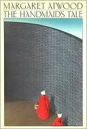
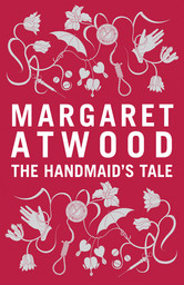
Looking at all the previous cover versions was quite interesting. Over 40 years from the first edition in the 1980s to the latest edition in the 2020s, the designs have changed. For example, the first edition looks quite abstract and stylised with a muted colour palette. However, the colour red doesn't dominate the cover or use any symbols to represent the book. The 1990s used more photography, which was more emotional and symbolic, especially the 1998 cover featuring a photo of the woman's mouth pinned shut to represent oppression. By the 2010s, the colour red is becoming more prominent, a more limited colour palette is used and the cover conveys more texture and atmosphere. The recent covers are much more abstract, and the illustrations are simpler, with minimal detail. Red, white and black are the colours used to focus on the silhouette of the Handmaid and her bonnet.
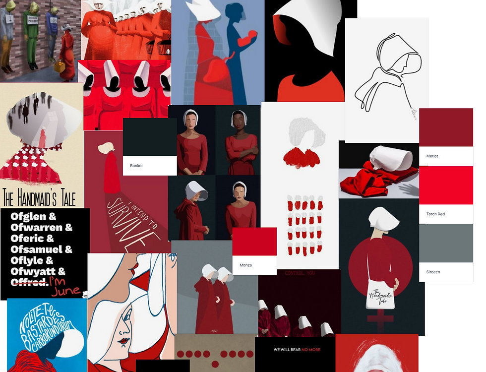
Moodboard
I created a moodboard to generate more ideas using images from the internet. This gives me an idea of the colour palette, shapes and tone of The Handmaid's Tale. Click here to see the whole moodboard.
Sketchbooks
I took some of the main conceptual motifs such as the bonnet, the eye (always watching), the wall (being confined) and the cloak, worn by the Handmaid's, and very roughly sketched them in my sketch book. I then started to think about the typography and the colour palette.

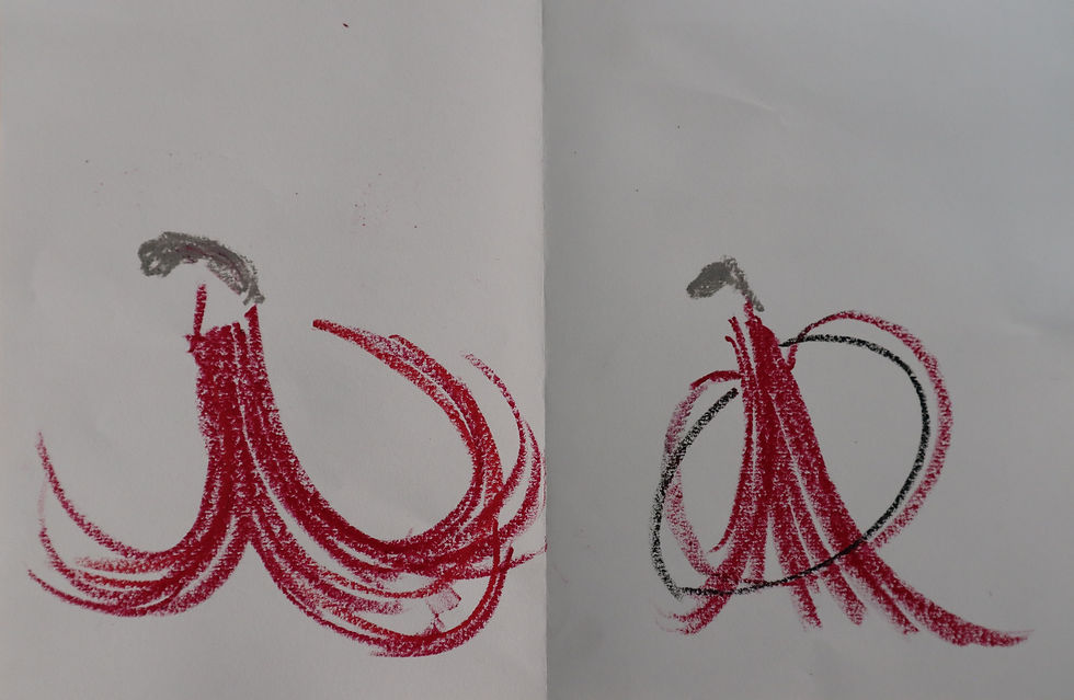
I decided that the bonnet and the cloak were the direction I wanted to go in because these are the main motifs that stand out the most. I sketched some thumbnails of the bonnet with marker pens, using a limited colour palette of black, white, red or grey. I then switched to oil pastels because of the effects and textures they create.
I then thought that the cloak was more symbolic of the Handmaid's and because they only wear red, it limited what I could use for the colour palette. I experimented with walls and circles. (Circles to symbolise the fertility of the handmaids) In all of the thumbnails, I didn't want to show the Handmaid's face, so I went with a more abstract look.

Still going with the cloak and circle theme, I tried out the sketches in oil pastel on different coloured paper. I found that they gave quite striking effects.


I then experimented with white paper. With this experiment, the contrast is great, but at this stage I don't think white is dramatic enough to symbolise the lives of the Handmaids. I added in the black for the circles because of the brutal way the fertility of the Handmaids was abused.
I tried one last time to get the circles incorporated into the image without it looking too flowy. So I added the grey to emphasise the circles flowing from the cloak. I think I will transfer this into Adobe and play around with the style more on the computer.

Once I had edited the image into Adobe Photoshop it looked like this:

However, I wasn't happy with this at all and decided to literally go back to the drawing board or sketchbook! This time I wanted to expand on the black background as I felt this would give a more dramatic look to the cover, and I used black paper with red pastels. These were the results of my experiments below:

I found red pastel contrasted more with the black background. With the white pastel, I created a circle that flows from the Handmaid's cloak to represent fertility. I left the face blank to symbolise the non-identity of the Handmaids except for the colour of their cloaks.
I then imported the image into Adobe Photoshop and this was the result after some slight editing.


I made the colours more vivid so the background would be as black as possible. It also enhanced the texture of the pastels. I like the overall contrast and the movement the image gives.
I then went on to experiment more on the typography. In my sketchbook, I tried with calligraphy. My idea was to incorporate the "old" values into a more modern image. I realised that I was spelling the authors surname incorrectly and corrected it at the end.

I then imported this into Adobe Illustrator to remove the background, convert it into an outline so I could change the size and shape of the writing.
Composition experiments
Once I had the image and the calligraphy ready, I used these elements to create different compositions in Adobe InDesign, I created 10 different looks, where I experimented with the scale, repetition, colour and typography.

Final Composition
After experimenting with the different ways I could make the cover look, I decided to choose this one (below), because it was modern, abstract and symbolic. I found that the cover was quite striking because of the limited colour palette, but also with the Century Gothic typography. I'm glad I settled with pastels in the end because I like the way they gave the image texture and movement.

Final Mock-up

Reflection
I found this exercise very useful because it forced me to look at a book I hadn't read before. In a way, this was probably better because I didn't have preconceived ideas of how the book cover should be. As I researched the keywords and watched the TV adaptation online, I got a better sense of the book's mood and genre. I could grasp the main concepts of the story and brainstorm my ideas. If I had more time, I would have read the book to gain a better understanding. I believe immersing yourself in a topic gives a better outcome.
My research then took me to the book's past covers and to how it had evolved over the last forty years. The first edition had a muted colour palette, but fast forward to the 2020s, and the colour palette had strong contrasts, especially with red, black and white. I feel that with the era of gender based violence being an issue that is being recognised, the shift in people's views and attitudes feeds into this stark colour palette.
My previous exercises led me to think about conceptual and expressive approaches to design and this helped me in this exercise to develop the concepts further. While sketching ideas in my sketchbook, I could see the Handmaid's Tale themes such as eyes, (always being watched) the walls, (being confined), circles to symbolise fertility and developing the motifs such as the bonnet and the cloak. From there I could experiment with the colour palette and the typography.
My experiments with different materials were interesting because I knew what I wanted the cover to look like, but couldn't get the effect I wanted with marker pens and oil pastels. Eventually, I played around with pastels, which gave me the texture and colour I was looking for. Using different colour paper was also helpful because I could see how the contrast would work. Once I was happy with the image I could experiment with typography. I thought by doing calligraphy I could bring some of the "old" values that the Handmaids live by and incorporate them into a more modern abstract image. The thumbnails were very useful to do because I could change the layout, the colours and typography and find something that worked as a cover.
Overall, I'm happy with the outcome of the cover and enjoyed the process of experimenting and trying things out.
References
The Handmaid's Tale (2017) Directed by Morano, R. [Showmax] At:https://www.showmax.com/watch/asset/series/the-handmaids-tale/ce411a9b-465b-3473-843f-2ec074501385?orig_ref=https://www.google.com/ (Accessed: 08/11/2025).
Images
Fig. 1 Goodreads (1985-2021) Handmaid's Tale Book covers. [Images] At: https://www.goodreads.com/work/editions/1119185-the-handmaid-s-tale?page=4 (Accessed: 01/11/2025).


Comments